Benjamin Hill travels the nation collecting stories about what makes Minor League Baseball unique. This excerpt from the Baseball Traveler newsletter, presented by Circle K, is a mere taste of the smorgasbord of delights he offers every week. Read the full newsletter here, and subscribe to his newsletter here.
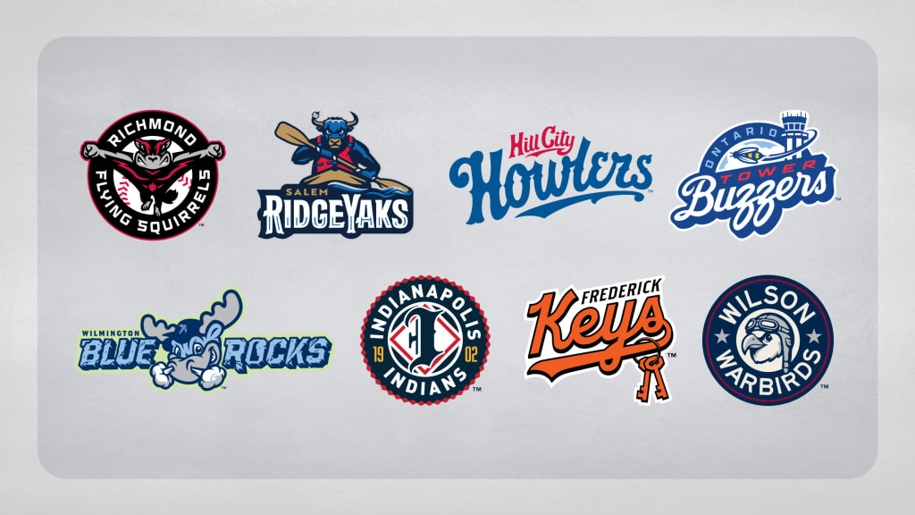
"Pitchers and catchers report" is a well-established harbinger of spring. Here’s another one: All new Minor League team names and regular logos have been unveiled for the year. From brand-new identities to logos tweaked for a new era, here are the teams who will enter 2026 with a fresh look. You can see them all on the field soon, as Minor League Baseball's Opening Day is less than two months away.
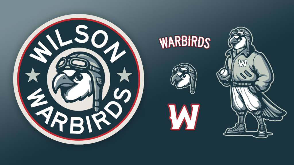
Team: Wilson Warbirds (Single-A MIL)
Unveil date: Nov. 22, 2024
Occurrence: New team
Designer: Rev Pop
The Zebulon, N.C.-based Carolina Mudcats have relocated 25 miles to the east and will now be known as the Wilson Warbirds. This identity, which was announced prior to the Mudcats' final season, is a tribute to the Wilson area's aviation history. The city was once home to a World War II-era naval aviator training center and Warbirds is a term for retired military aircraft that have been restored. Read more »
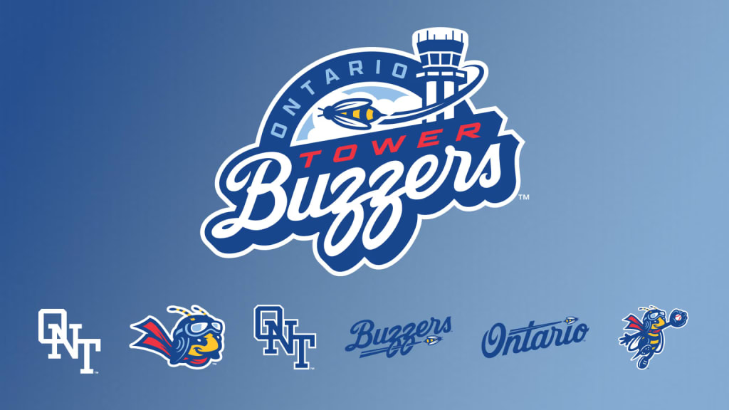
Team: Ontario Tower Buzzers (Single-A LAD)
Unveil date: Sept. 18
Occurrence: New team
Designer: Studio Simon
The California League will have a new look in 2026. The Modesto Nuts are no longer part of the circuit, and the Ontario Tower Buzzers are in. The Tower Buzzers name is inspired by a line in "Top Gun," their mascot is named Maverick and the logo set -- dripping in Dodger blue -- makes prominent use of a bee who literally buzzes the tower. The aviation theme extends to the name of the team's ballpark as ONT Field is a nod to the three-letter code for the Ontario International airport. Read more »
Also new in the Cal League: The Inland Empire 66ers, previously an Angels affiliate, are now with Seattle. The Rancho Cucamonga Quakes, previously a Dodgers affiliate, are now with the Angels. Both clubs have updated their logos to reflect these new affiliations.
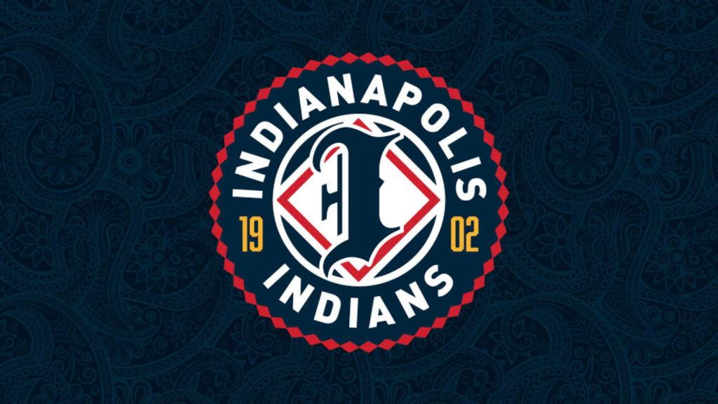
Team: Indianapolis Indians (Triple-A PIT)
Unveil date: Sept. 26
Occurrence: New logos
Designer: Adam Pintar (Indians senior director of brand, marketing and communications)
The Indianapolis Indians were established in 1902 and have long boasted the longest-running consecutive usage of a team name in all of Minor League Baseball. Their new logos, the team's first update to their look in 32 years, were created in consultation with the Miami Nation of Indians of Indiana. The logos draw in influences from all eras of franchise history, with an emphasis on, as the team puts it, "early 1900s baseball heritage and the club's role as Indy's original home team." Read more »
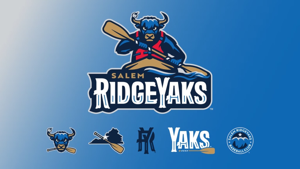
Team: Salem RidgeYaks (Single-A BOS)
Unveil date: Nov. 9
Occurrence: New team name and logos
Designer: Collegiate Licensing Company
Salem, Va.'s team had been known as the Red Sox, going back to the 2009 start of their Boston affiliation. That relationship remains, but now Salem is entering its RidgeYaks era. It's a tribute to the Blue Ridge Mountains, which loom beyond the ballpark, and all the outdoor activities on offer in southwestern Virginia. That's why the yak in the primary logo is depicted on a kayak and, hey, yak is short for kayak (as well as a baseball slang term for a home run). Read more »
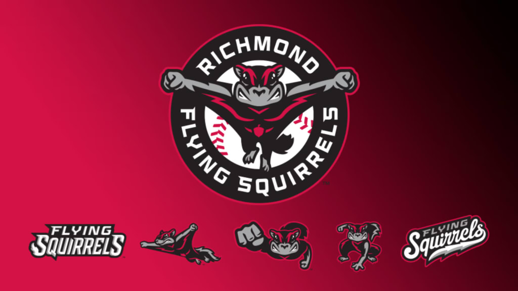
Team: Richmond Flying Squirrels (Double-A SF)
Unveil date: Nov. 12
Occurrence: New logos
Designer: Brandiose
The Flying Squirrels are moving into a brand-new ballpark for the 2026 season and have adopted a new look to go with it. The Richmond logo -- featuring a flying squirrel midflight -- has always been a fun one and now it’s a little nuttier, with the squirrel in question facing front as though to leap off the cap and into your arms. A new set of uniforms (home, away and two alternates) are part of the refresh. Read more »
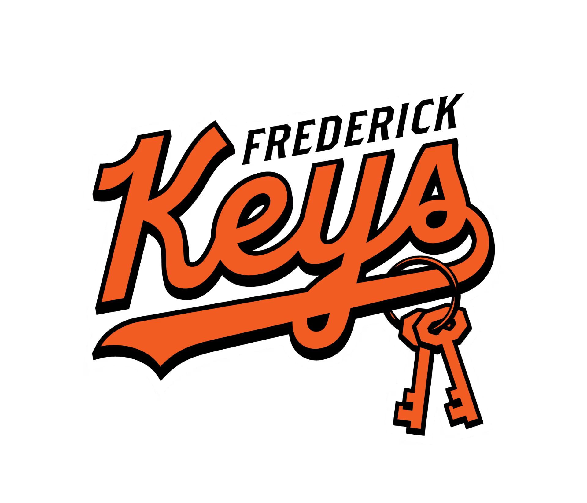
Team: Frederick Keys (High-A BAL)
Unveil date: Dec. 10
Occurrence: Refreshed logos for a team re-entering Minor League Baseball
Designer: Younts Design
After five seasons in the MLB Draft League, the Keys are once again the High-A affiliate of the Baltimore Orioles (a position they held from 1989-2020). The team unveiled a fresh set of logos to celebrate their re-entrance to Minor League Baseball, tweaking the primary mark and introducing some alternates. While the team is named for Francis Scott Key (who is buried in a cemetery across the street from the ballpark), the new primary logo emphasizes a pair of literal keys. Read more »
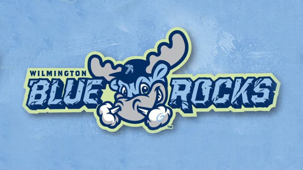
Team: Wilmington Blue Rocks (High-A WSH)
Unveil date: Jan. 23
Occurrence: Refreshed logos
Designer: The Barn Creative
The Blue Rocks stayed true to their "Blue" while making their "Rocks" a little more concrete. Concrete, that is, in the sense of less ambiguous; the Blue Rocks' "Rocks" are granite -- specifically, a blue-ish granite found in the nearby Christina River. The new look adds a granite-like texture to the lettering, as well as bringing in a secondary logo featuring a pickaxe (with which, presumably, to harvest granite).
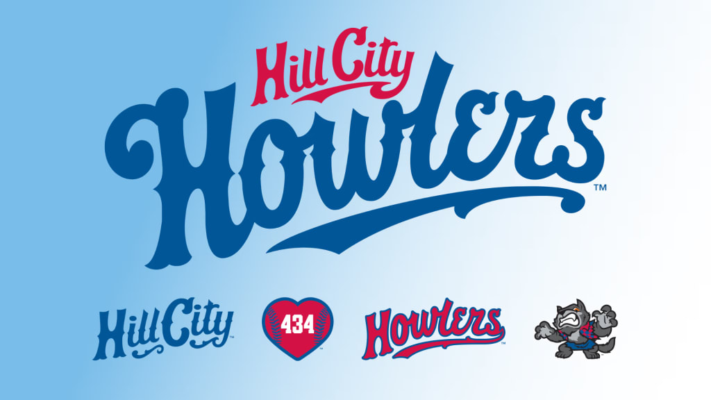
Team: Hill City Howlers (Single-A CLE)
Unveil date: Feb. 13
Occurrence: New team identity
Designer: Brandiose
After three decades as the Hillcats, Lynchburg’s Carolina League team is now the Hill City Howlers. Hill City is a nickname for Lynchburg, referencing its location in the foothills of the Blue Ridge Mountains. Howlers is a reference to a new group of monsters in town, a ragtag assemblage led by Indy the werewolf (a literal howler). These monsters, all of whom are represented as secondary logos, traveled to the ballpark via the tunnels that led there from nearby Spring Hill Cemetery. Do the Monster Mash! Read more »