Since clothes are the first thing people notice about us, they tend to define us. But what about when the threads are absolutely insane? What about when your clothes are a technicolor dream (or nightmare, depending on your taste)?
That's what we're going to look at today, with some of the wildest uniforms that have ever been donned on the ballfield. Also, note, we'll only be looking at the kits planned to be worn in regular rotation -- so all those Minor League promo jerseys featuring jeans or hairy chests aren't included. And, sorry, but that also means the Mercury Mets' Turn Ahead the Clock jerseys don't make the cut.
What does? Read on and find out:
A's - California sun
Owner Charlie Finley never saw a promotion or marketing effort he didn't love and handing the Athletics green uniforms that set them apart from the rest of the league was maybe his best.
The look was nice in Kansas City, but worked best in the warm, Bay Area sun. Especially when the team decided to rock a nearly all-yellow number. The team brought the look back for some picture-perfect throwbacks in 2013:
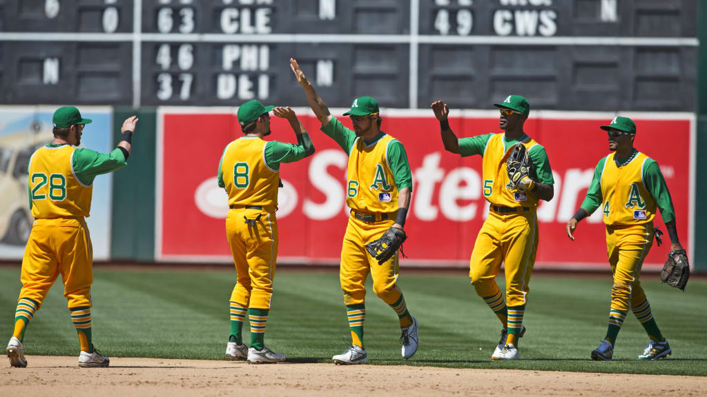
They also wore all-green just once before it was retired:
Denver Bears - "Strike zone" unis
The infamous Denver Bears “strike zone” uni made by the Max Good Sporting Goods Company in Denver, according to Marshall. I’ve seen the front before at @Bballparkmuseum but I feel like I’ve never seen the back. These belt tunnels and pocket flaps ohmygod. @UniWatch @PhilHecken pic.twitter.com/qnPnL3zWPA
— Tyler Maun (@TylerMaun) June 12, 2018
People have been trying to make the strike zone easier to see for a long time. You think that the little box that shows up on your TV screen was the first experiment?
So, back in 1952, the Denver Bears put together this jaunty little number, with thick blocks of color at the chest and the knees to try and help the umpire see the strike zone better. This uni even had a patent.
The uniforms only lasted one year, but they did their job: The Bears won the Western League that season and finished with the same number of walks as strikeouts: 737. Spooky, right?
D-backs - Just, like, everything, man.
Arizona has been a space-age uniform testing facility for years without us even realizing it. They showed up in the Majors wearing a teal and purple pinstripe uniform. That's pretty dang bold:
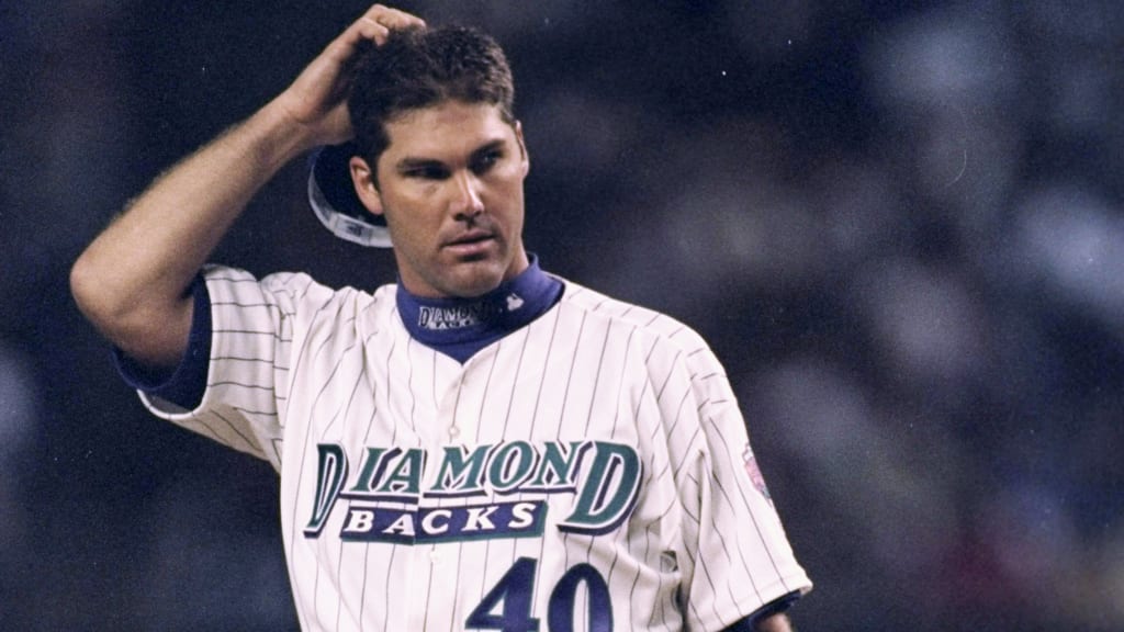
And then, they decided to jump 50 years into the future when they unleashed a whole squadron of new unis featuring sublimated snakeskin graphics and wild colors before the 2016 season:
Sure, the home uniforms with the red on the back of the pants made it look like the players were bleeding, but the dark gray and teal uniforms will one day be obsessed over by nostalgic collectors -- even if few embraced how cool they were at the time.
Dodgers - Satin blue
Sky blue? Check. Satin? You better believe it. As night games came into vogue in the 1940s and ‘50s, a few teams wanted their players to look positively reflective under the stadium lights (makes me think more bicyclists should be wearing satin).
None did it better than the Dodgers. Honestly, Elton John would have looked good in these numbers.
L.A. wore throwbacks in 2011, but they skimped out on the shimmery, reflective surface. Guess they didn't want to be Knights of Blue Satin.
Giants - Purple checks
In a different world, the Giants wouldn’t wear their iconic orange and black, but purple. That’s because manager John McGraw was a devotee of NYU's colors of violet and white.
That led to the classic 1916 Giants uniforms that feature two things you're more likely to see hanging off the rack in a Brooks Brothers than on the field: A purple checked outfit.
Grizzlies - Tacos
The Lehigh Valley IronPigs may have beaten the Grizzlies to the food rebranding launch when they started playing as the Bacon in 2014, but the Grizzlies did such a great job when they became the Tacos that most fans probably think that's the club's real name.
Each year the team tweaks the look a little, but they're always 1) colorful and 2) perfect.
Notre Dame - Alternate Green
College football is almost like an episode of "Project Runway" with some teams like the Oregon Ducks showing off a new look seemingly every week. That hasn't reached college baseball, but Notre Dame has an alternate uni that would fit on the gridiron.
Check this thing out: It's a solid green uni -- a brighter shade than even the A's are willing to wear -- coupled with a gold reflective helmet. It may be audacious, it may push the limits of good taste ... but it's also pretty sweet.
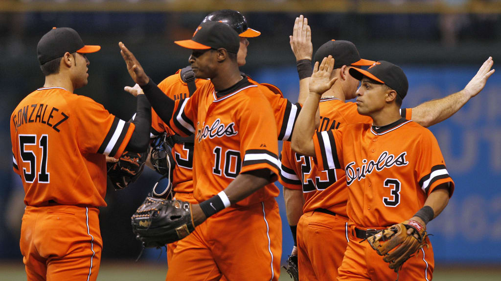
Orioles - Orange Dream
The team debuted these bad boys in 1971 and only wore them a few times before they were retired in 1972, but what an impact they made. That year, the Orioles had four 20-game winners in the rotation -- surely because the uniforms blinded the hitters at the plate.
The club brought them back for a throwback game in 2010, and they look just as fresh today. Sadly, after the game, O's manager Buck Showalter -- not a fan of the uniforms -- made it clear that the team would not be wearing them again.
Phillies - Big Grape
They only wore the look for one game -- May 19, 1979 to be exact -- before a near mutiny ensured that the kits were put in mothballs. The players thought the uniforms made them look like giant grapes, and Greg Luzinski told the owner that they could trade him before he’d ever be caught dead wearing it again.
It wasn’t all that bad, though. When the Phillies donned the throwbacks last season, they made them look incredibly cool.
While the looks weren't used on the field, we want to give props to the Phillies for having the freshest usher’s uniforms. This must have been what the guards in "The Prisoner" wore.
Pirates - Endless combinations
Oh, the glory of polyester. With the range of colors and designs available, the Pirates went wild and put together a stunning combination of colors and patterns -- basically, they were human paper dolls.
Yellow tops and black pants? Sure. Pinstripe tops and pinstripe bottoms? Yeah, why not. Black tops, yellow pants? Yup. Mix and match from there? Absolutely.
When the Pirates faced off against the Orioles in the 1979 World Series, it was an acid trip of a Series. It was just a shame the O's didn't wear the all orange togs.
Rays - Fauxbacks
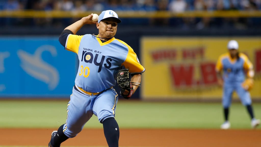
Now, I said at the top of the post that we wouldn’t include one-off jerseys, and that’s what this uniform initially was: A one-off fictional version of the Rays that never existed.
But this uni -- heavily inspired by the fantastic, way-out-there uniforms the Padres wore from 1978-84 -- proved popular. With the Sunkist-like logo and use of teal and yellow, the Rays ended up wearing it over and over, eventually becoming an actual part of the Rays history even though they never existed during the hallucinatory '70s.
San Francisco Sea Lions - Wrong logo
OK, this a strange one: The Sea Lions were a short-lived Negro Leagues team in the 1940s. The odd thing, though: Their uniform featured a large bear -- not a sea lion.
Why? The folks at Ebbets Field Flannels discovered the answer: The team had bought their unis from a local semi-pro club known as the San Francisco Cubs.
Oddly enough, this team also had a Willie Mays ... but he was a different Willie. Even stranger, it was most likely not Mays' father.
Tucson Toros - One too many tequila sunrises
You thought the Astros' Tequila Sunrise unis were colorful? Well, get ready for the 1980 Toros, who did their best to match their parent club's uniforms while simultaneously, um, looking like they just threw up all over themselves.
We’ve got multiple shades of orangeish-yellow, brown, mint green, red, and quite possibly colors that aren't visible to the human eye, but makes dogs howl in pain.
White Sox - Who likes short shorts?
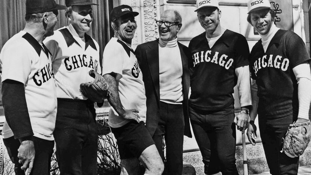
Since summer is marked by the emergence of calves as we all run around in our cutoff jean shorts, it only makes sense that baseball players should be able to show off their beach-ready legs, too.
Bill Veeck had the same idea, so in 1976 he took fashion to the future and had the White Sox play in their vacation outfits. Chicago wore the shorts for three games before they were summarily dispatched to the wastebin of history.
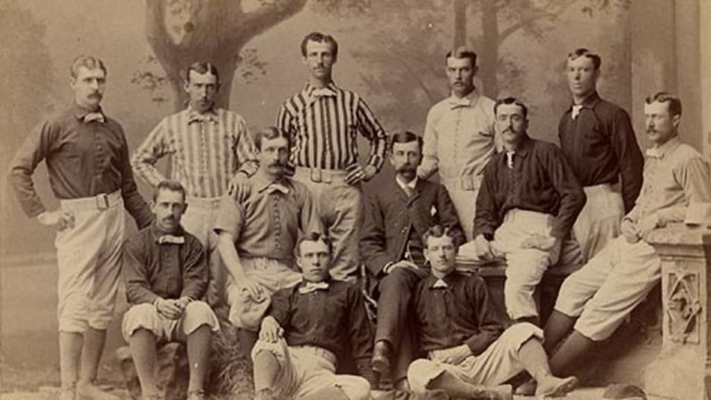
1882's chaotic eyesore
And finally, I'll leave you with the oddest uniform of all, one that quite frankly must have hurt the eyes and looked like absolute madness on the field. In 1882, the National League adopted a league-wide rule that called for players to wear color-coded uniforms that corresponded to their position on the field.
As Todd Radom explained in "Winning Ugly," each team's catcher was "clad in scarlet, a right fielder in gray, a first baseman in scarlet and white stripes, and so on."
This is what the Wolverines looked like that year: