Six secrets you never knew were hidden inside of MLB logos
You've probably seen most Major League logos countless times. But how often have you looked at them -- like really, really looked at them?
It turns out that big league teams have been hiding all sorts of stuff -- symbols, subliminal messages, optical illusions -- in plain sight, right under your nose this whole time. Because if there's one thing that baseball has taught us, it's that even graphic design can cause all sorts of weirdness.
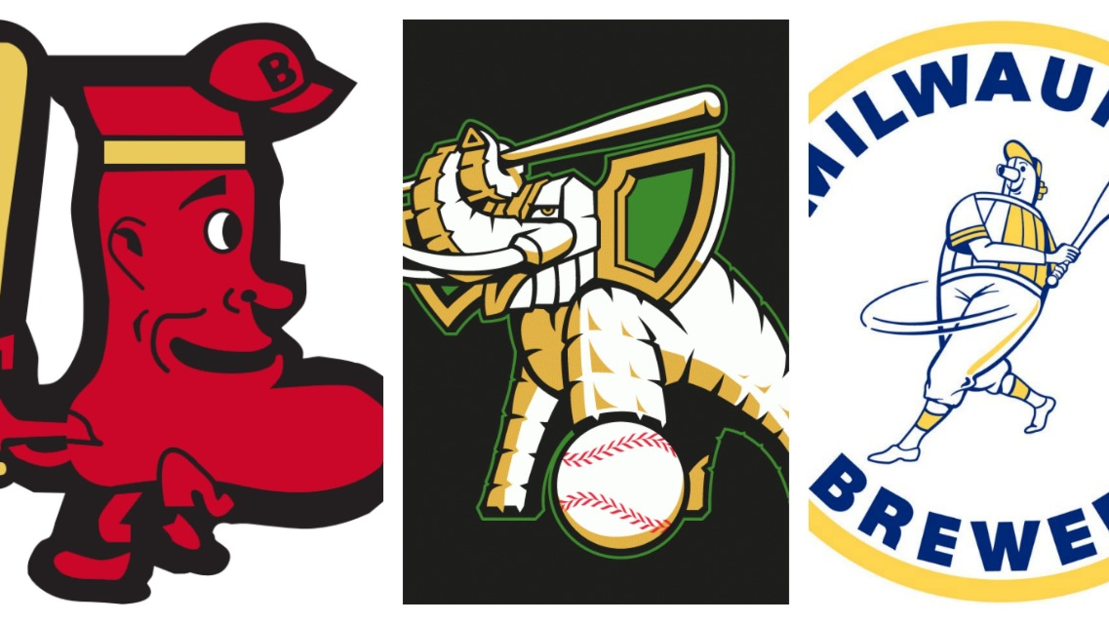
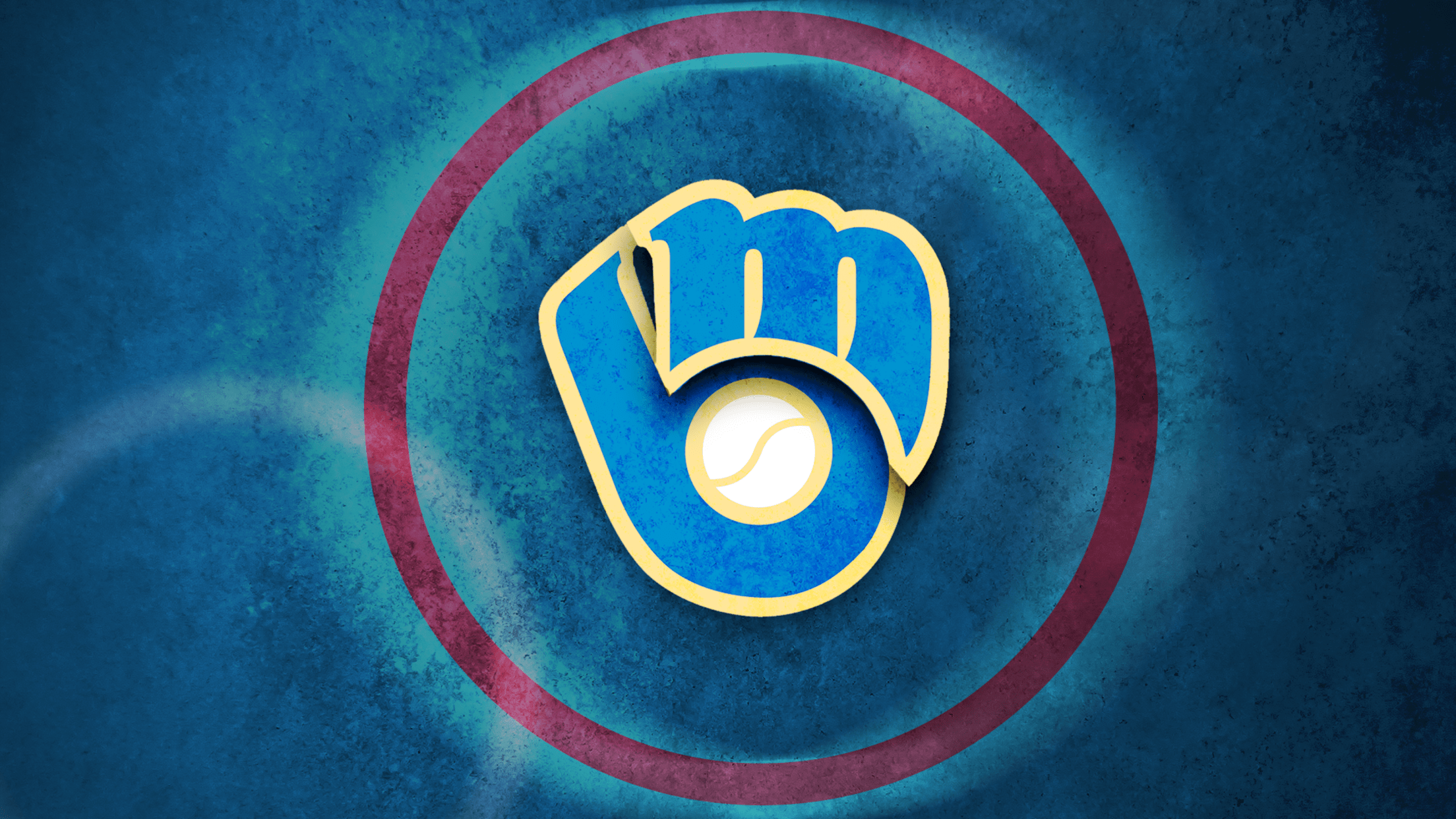
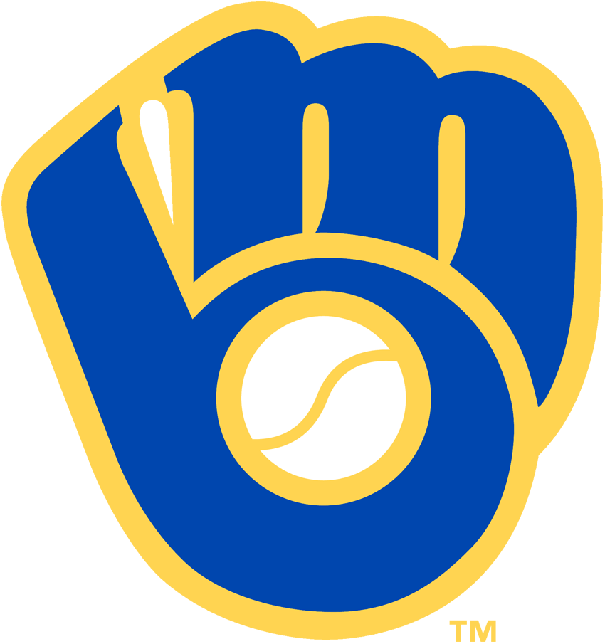
The Brewers
Milwaukee's blue and yellow glove logo is a classic, one of MLB's truly timeless looks. It's more than just a glove, though: The image also contains the team's initials -- the "m" is the webbing of the mitt, while the "b" is formed by the palm and the thumb.
The Expos
The Expos' logo was undoubtedly excellent, but it was also a bit of a Rorschach test: Depending on how you look at it, you could see any number of shapes and symbols in there.
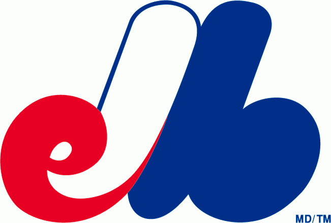
Is it one big, cursive "M" for Montreal? The letters "ELB," for ... Expos League Baseball, maybe? Or is it a stylized "CB" -- the initials of the team's owner, Charles Bronfman?
The answer, as it turns out, is a mixed bag. The overarching shape is indeed an "M" for Montreal. The team managed to stuff that M with even more messaging: a lower-case "e" on the left-hand side, for Expos, and a lower-case "b" for baseball on the right.
The Padres
At first glance, this one seems easy: That's an interlocking "SD," for San Diego, right?
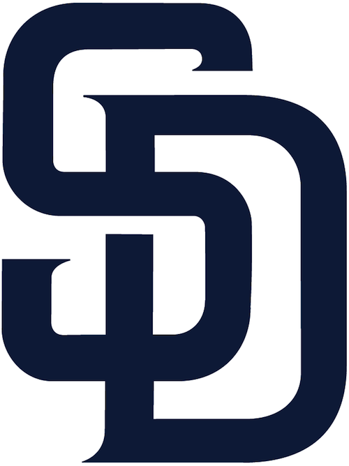
Well, yes, but look a little more closely. See it yet?
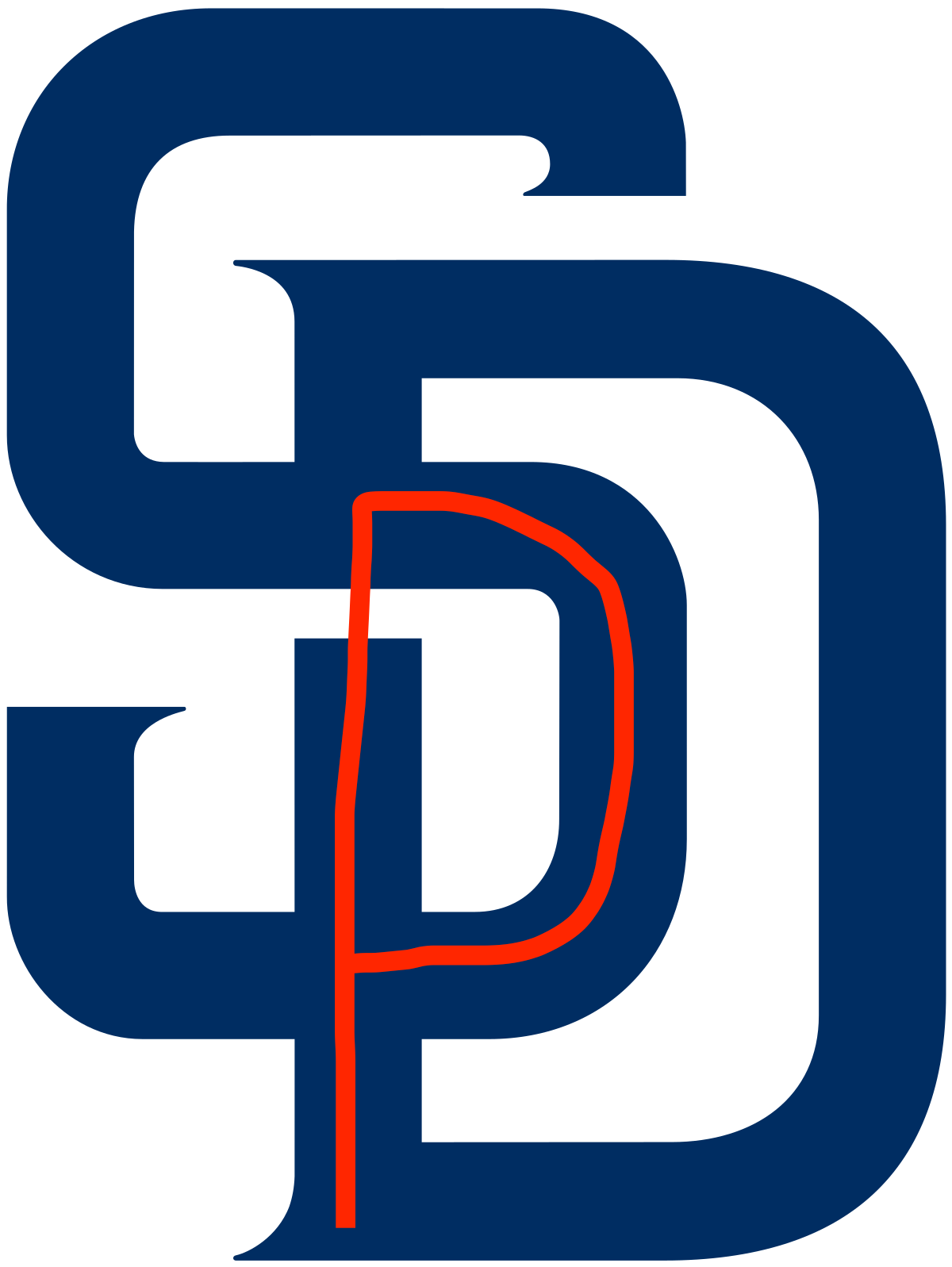
The two letters combine to form a "P" for Padres, which we'll never be able to unsee.
The Mets
It's probably not news to you that the background of the Mets' logo features a representation of the New York City skyline. You may even know that that's the Empire State Building smack in the middle.
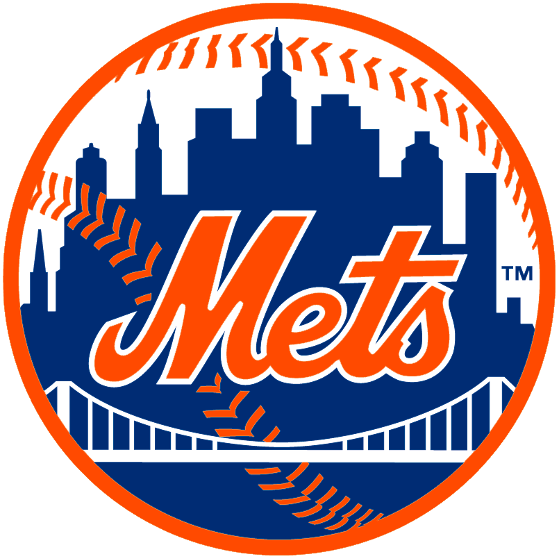
What you may not know, however, is just how detailed that representation is. We'll let the team's website take it from here:
At the left is a church spire, symbolic of Brooklyn, the borough of churches. The second building from the left is the Williamsburgh Savings Bank, the tallest building in Brooklyn. Next is the Woolworth Building. After a general skyline view of midtown comes the Empire State Building. At the far right is the United Nations Building.
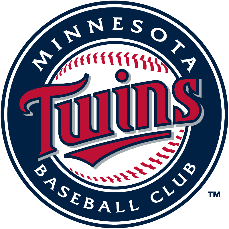
The Twins
As a professional baseball club, Minnesota is in the business of winning. It says it right there in the team's anthem:
That dedication to winning goes far beyond obscenely catchy jingles, though. The logo even underlines the word "win" in "Twins":
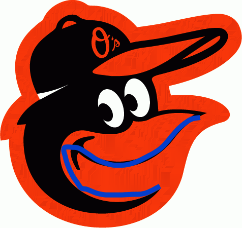
The Orioles
This one isn't a secret so much as a riddle, one that has vexed even baseball's most serious thinkers for decades: Does Baltimore's cartoon bird have his mouth open ...
... or closed?
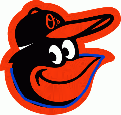
(Please note that the only acceptable answer here is "closed".)