The throwback uniforms we'd love to see from National League teams in 2017

Throwback nights are some of the most exciting promotions in baseball. With some teams enjoying a history of over 100 years, there are plenty of great uniforms to cull from to create an on-field visual art display deserving of a MoMA exhibit.
At the same time, there are many that have yet to make a comeback that are more than deserving. Here are the uniforms for the National League that we'd like to see return to the Major Leagues on throwback night. You can check out the American League here.
Arizona Diamondbacks: 1998 road

The D-backs have already embraced their purple as a throwback, but there's still one jersey we'd love to see from their old days: The 1998 road unis. Not only do they have the retro purple and pinstripes, but the cap is a sharp black with a teal brim that is more than ready for a return.
Atlanta Braves - 1946 home
The birth of night baseball in the 1930's led to an amazing fashion trend that died out far too soon: Satin uniforms. The Dodgers wore a throwback that was styled like their satin uniforms in 2011. Only problem? They didn't sparkle in the light.
The Braves should do it like a Las Vegas show and don these glittering jerseys again.
Chicago Cubs - 1908 home
(courtesy of Marc Okkonen)
The Cubs have some strange uniforms in their history, like the sky blue road vests they wore in 1942. But, with the team celebrating its first World Series win since 1908, is there any other choice?
Of course, they should update this one a little by adding gold and "World Champions" to it -- just like the 1906 Giants.
Cincinnati Reds - 1956 road

Three facts:
Reds: It's time to be like Ted Kluszewski again.
Colorado Rockies - Purple Row

Unlike the Marlins, D-backs and Rays, the Rockies haven't had a rebranding since joining the league. In fact, until they recently altered their logo and purple uniforms with a different shade of the color, they had never undergone a logo change.
Rather than putting the team back in the '93 unis again, we're going to make one up, just as the Rays did for their 1979 days.
So, Rockies, give in to royalty with purple pants and a purple top. Just add a golden cape and this is literally fit for a king.
Los Angeles Dodgers - 1916 away
(courtesy of Marc Okkonen)
Too often a baseball jersey doesn't fit both on the ballfield and the boardroom. The 1916 Brooklyn Dodgers were ahead of their time, as they wore a patterned uniform that fit in any company's business casual style guide.
Miami Marlins - 1993 home

If you weren't alive in the '90s, you may have forgotten that teal was apparently the only color humans could see. Every kid would walk around, covered in Marlins and Charlotte Hornets gear, simply because it was teal.
Those '90s kids are now parents, who likely want to deck their children out in the teal again.
Milwaukee Brewers - 1969 Seattle Pilots

The Brewers have done a great job incorporating their retro designs into their modern looks: The old ball-in-glove logo has been featured prominently in recent years. (It's also an 'M' and 'B.' Don't feel bad if you never realized it before.)

That doesn't leave a whole lot to throwback to (the less said about the '90s unis the better). Though the Mariners wore 1969 Seattle Pilots throwbacks in 2006, considering that the team would go on to become the Brewers after their lone season, and that this sky blue shade wasn't featured, it's high time for the scrambled egg caps and compass ... thing ... to return.
New York Mets - Mercury Mets
It's 2015, shouldn't the mets be on Mercury by now? #Turnaheadtheclock https://t.co/7I9UvGuLa0 pic.twitter.com/3oTW6ksG2i
— Mess Bog (@MessBog) July 15, 2015
Since their birth in 1962, the Mets haven't done much to rock the boat on what is a gorgeous uniform: orange and blue with an interlocking N and Y.
That leaves the best example to the Turn Ahead the Clock promotion: The Mercury Mets. We may not have outer space baseball in our lifetimes, but this isn't a bad replacement.
Philadelphia Phillies - 1934 home

You can see a clear line to the current Phillies uniform from this one, but the baseball-y script, piping and red and blue hues (which you can't see in the photo) make this a beautiful jersey that would look just as good today.
Pittsburgh Pirates - 1902 road
After bringing back the yellow tops, black pants and pillbox caps from the 1979 season last year, you may have thought there wasn't another uniform due for a comeback. You'd be wrong. Look at the glory that is the uniform they wore in 1902:
- Collared shirt.
- Shirt pocket.
- Sleeve stripes!
San Diego Padres - 1985 prototype
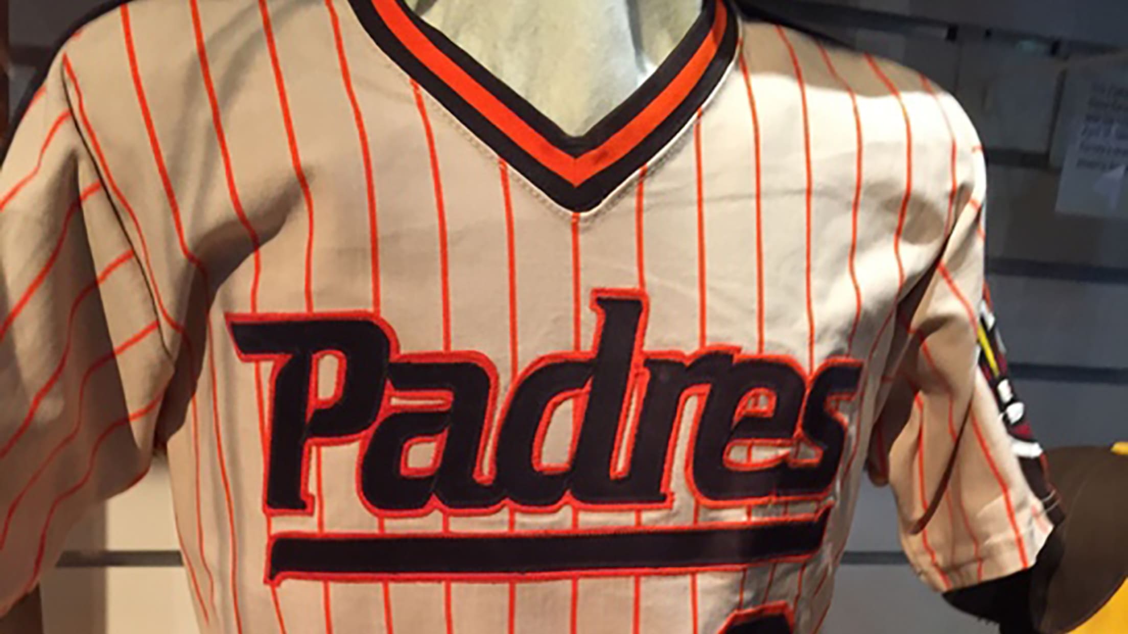
Thought we were going to go with one of the brown-and-yellow glories from their early days, didn't you?
Instead, it's the orange pinstripe pullover prototype (including an underline referencing the Padres' Pacific Coast League teams in the 1950s) that was nearly the uniform before the team instead chose a brown and orange button-down option. Its time has finally come.
San Francisco Giants - 1916 home
Nearly every color imaginable is now visible on Major League fields. One notable exception: Pink. The New York Giants were well ahead of their time in 1916. 101 years later, it's due for a comeback.
St. Louis Cardinals - 1928 home

For a team as old as the Cardinals, it's remarkable just how much uniform consistency they've had. Save for slight variations, the bird on the bat has been a staple since 1922.
But in 1927-28, they not only had pinstripes, but the Cardinal was moved over the heart. Sadly, the Cardinals won't be able to bust out the '27 ones until October at the earliest: Those had "World Champions," surrounding the bird.
Washington Nationals - 2006 alternate

The NBA's Trail Blazers have jerseys representing "Rip City," a nickname for the town. The Nationals can go back with uniforms that represent the District -- an actual name for the city -- and something no other Major League can do.
Will we see any of these jerseys this year? Possibly. Will we take all the credit for them if they show up? Absolutely.