


Baseball fans love to argue. It’s probably their second-favorite thing after, you know, watching baseball. And when not arguing about players or defensive shifts or if it’s better to pitch off the fastball or surprise with breaking stuff, it’s time to argue about uniforms.
So, today, let's add to that discourse: Which team has the best shoulder patch logo? After all, you’ve likely already argued about the best unis and the best ballcaps. But have you argued about the alternate logos that get prime placement on the players' shoulders? Thought not.
1. Padres
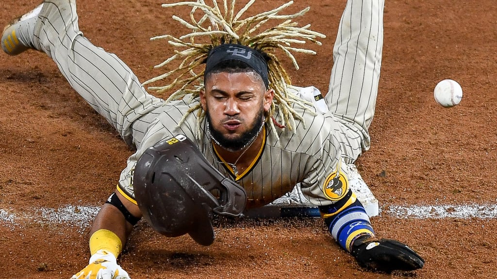
The Padres picked the perfect year to go back to the brown uniforms. Not only do the unis look good, but the insanely talented and exciting players wearing them certainly help.
It's honestly a little unfair that they have the best shoulder patch, too. Check out that lovely swingin' Friar, who looks better in the yellow and brown, too. (Though his swing looks like he's embraced the launch angle revolution a little too much).
2. Twins
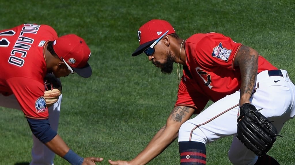
Most sports designs feature formidable and ferocious mascots. We need more showing smiling, friendly people, happily shaking hands.
Does this inspire fear in your opponents? No. But does it let them know you'll smother them with kindness? Absolutely.
3. Brewers
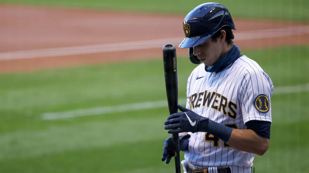
The Brew Crew released a new set of uniforms this year that are absolutely gorgeous. Anyone with even a modicum of good taste enjoys the collegiate style kits and sharp interplay of blue and yellow.
So, while you have probably figured out that the cap logo hides an "M" and "B" inside, you may have missed this other Easter egg. Check out this baseball with wheat -- a crucial component in brewing -- as the seams.
4. Mets
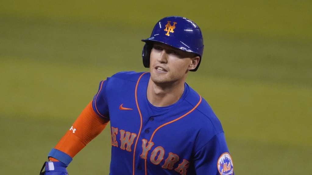
The New York skyline behind the Mets’ script font is one of the greatest logos ever made. 'Nuff said.
5. White Sox
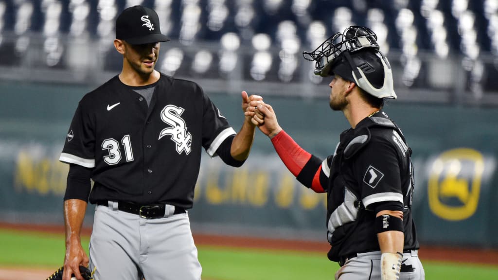
Sure, it’s simple -- just a plain, white sock inside a baseball diamond -- but that’s where the beauty lies. It looks like it was taken straight from a scorecard, and is the perfect symbol scorekeeping White Sox fans should use for home runs.
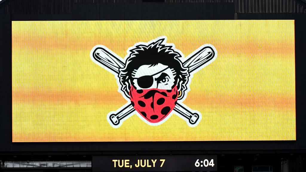
6. Pirates
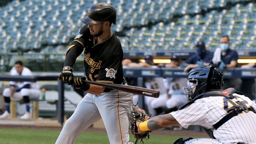
A team named the Pirates should have a fearsome, grizzled seafaring fellow staring back at you.
Though it would have been great if the team used this logo for 2020:
7. Athletics
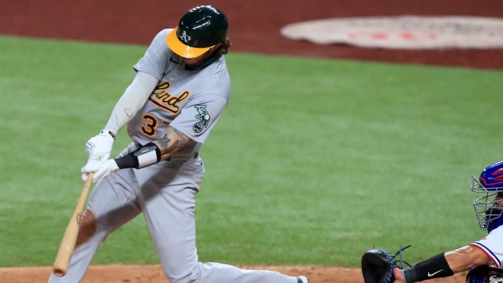
There has never been a better clapback in history. In 1902, Giants manager John McGraw said that Benjamin Shibe, the new owner of the then-Philadelphia Athletics, had bought himself a “white elephant.”
So, like a player using a criticism to fuel his performance, the A’s adopted it as their logo. Over 100 years later, it’s still pretty nifty.
8. Reds
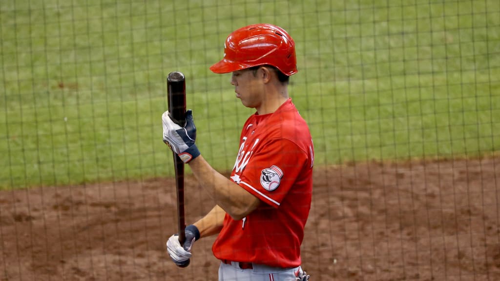
Because every team should have a terrifying mustachioed baseball man staring back at you.
9. Rangers
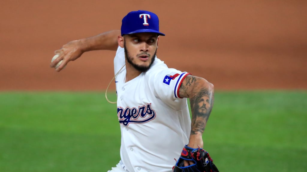
Sure, the Texas state flag may not be all that creative, but if the purpose of a team is to represent its fans, then it does the job. There’s nothing people from Texas love more than Texas.
10. Phillies
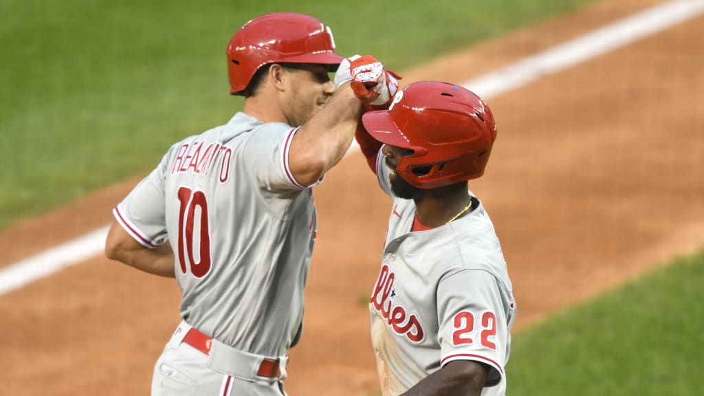
OK, so you may say this is cheating, but it’s so good it has to be included. The Phillies don’t have a shoulder logo, instead placing the player's uniform numbers on the shoulder.
Because that loopy Phillies font -- sorry, phont -- is so iconic, it counts.