

It's one of the mysteries of the ages, right up there with "Are we alone in the universe?" and "Who exactly bought all those Nickelback records?" -- just who is the inspiration behind the MLB logo?
In the NBA, it's basically a known secret that Lakers guard Jerry West was the inspiration for its logo -- but Major League Baseball is a little less clear.
The rumor for decades has been that it was based on Twins slugger Harmon Killebrew. But is that true? As always, the truth around these things gets kind of murky.
The logo was designed by Jerry Dior in 1968, as MLB was getting ready to celebrate the centennial of professional baseball the next year. It would make sense if Killebrew was the inspiration for the logo at this time: "Killer" was coming off a 44-home run season when he finished second in the American League in MVP voting in 1967. (Unfortunately, his 1968 season was a disappointment as he hit just .210 with 17 home runs in 100 games.)
The issue isn't complicated for Killebrew. The slugger, who passed away in 2011, is pretty sure it was him. Killebrew told Paul Lukas a story about arriving at the Commissioner's Office in the late 1960s, when he ran into a man working on a project in the office.
"He had a photograph of me in a hitting position, and he had one of those grease pencils that you see at a newspaper, and he was marking that thing up," Killebrew said. "I said, 'What are you doing with that?' and he said they were going to make a new Major League Baseball logo. I never thought any more about it. And then the logo came out and it did look like me. The only change was the angle of the bat -- they changed that to kind of make it fit more into the design."
If you see a photo of Killebrew at the plate and flipped it around, you could certainly see the resemblance:
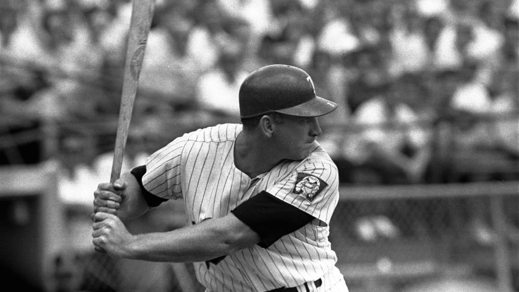
But, then again, there were a lot of players at the time who likely had similar stances at the plate. That fits more with Dior's recollection of the work.
"That's completely untrue," Dior said. "It's not Harmon Killebrew. It's not anyone in particular."
Dior later told Lukas that, "I did a couple of variations based on photographs I had. It was sort of composite of what I had in front of me."
Perhaps most surprising of all is the amount of time Dior spent on it: It took the designer one afternoon, and he presented it drawn in magic marker.
And that was it, the logo was finished. One afternoon, some markers and a little bit of mystery added up to produce the famous, iconic logo that will turn 52 years old this year.
While the faceless batter has never been changed, if he ever does, New Era has already produced one version that fans certainly love. Just swap out the nameless ballplayer for Ken Griffey Jr. and his backward cap: