

MILWAUKEE -- The moment Elaine Meindel saw her husband’s work of art and interpreted its meaning, she knew it was a masterpiece.
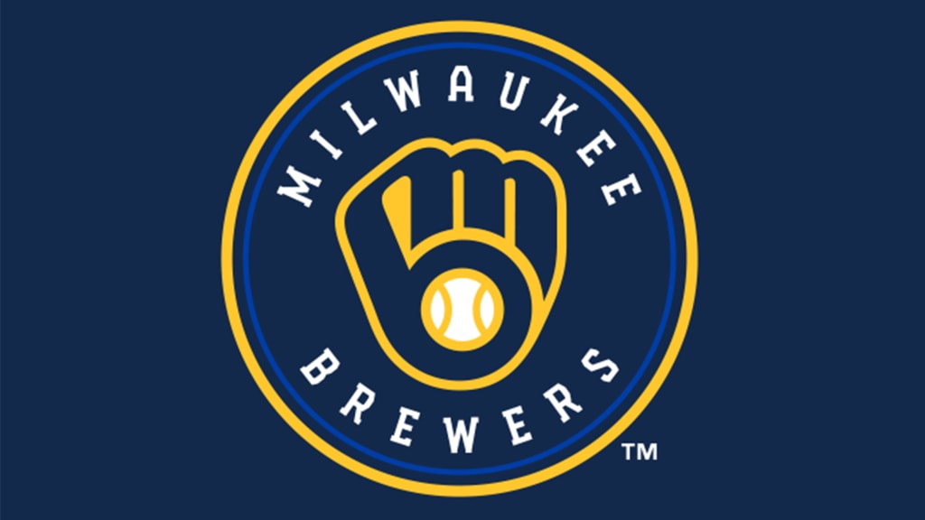
The Brewers’ now-iconic “ball-in-glove” logo was the creation of Tom Meindel, a 30-year-old University of Wisconsin-Eau Claire art student who submitted one of 1,932 entries in a team-sponsored contest in the fall of 1977. Eight losing seasons after arriving in Milwaukee, the Brewers wanted a replacement for the “Barrelman” logo. Meindel delivered a winner, an interlocking lowercase “m” and “b” that seamlessly formed the shape of a baseball glove.
Over the years, finding those hidden letters became a rite of passage for baseball fans young and ... well, not so young.
Curtis Granderson was 37 and playing for the Brewers when he looked at the cap hanging in his locker and finally saw it. At least, that’s the story he told Marc Carig of The Athletic in a moving story during the 2018 National League Championship Series about Meindel, who had taken his own life earlier that year. Another veteran Brewers player at the time, Erik Kratz, still remembered solving the puzzle as a kid.
“It’s like when they realize the arrow in FedEx. Look it up,” Kratz told Carig. “You’ll never look at FedEx the same way again. You’ll never not see it again.”
Decades after having that aha moment herself, Elaine Meindel recalled her excitement about her husband’s creation.
“You know that iconic movie, 'A League Of Their Own,' when Tom Hanks says, ‘We’re gonna win?’” she said. “I knew it when he sent it in. I just knew it. And I’m just so glad that they were appreciative of his artwork and they actually chose his.”
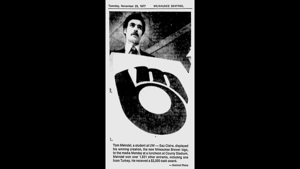
At the time, the Brewers said 54 percent of submissions came from the Milwaukee area, 42 percent from elsewhere in the state and 4 percent from elsewhere, including one proposal from a U.S. military serviceman who was stationed in Turkey at the time.
“A lot of these things were just terrible," Tom Skibosh, the Brewers’ publicity director at the time, told the Milwaukee Journal Sentinel in 2019. "There were stickmen holding a bottle of beer and that type of stuff. We had one with a really thick packet, had to be an inch thick, and it's a lawyer explaining how he gets all the rights if we pick his logo. It was a stickman with a mug of beer, too. He did more work in drawing up this guarantee than he did in his artwork. I was starting to panic because none of these were worth anything; they were pretty bad.”
When Meindel’s submission arrived at County Stadium, Skibosh’s mood improved. The colors were brown and yellow, which didn’t match the Brewers’ palette. But the design was genius.
Meindel, a father of two and a veteran of the Air Force, received $2,000 for his work, and the Brewers’ makeover was underway. The new logo and uniforms coincided with a front office shake-up and the arrival of general manager Harry Dalton, who quickly turned the team into a winner after a string of losing seasons. The Brewers went 93-69 in 1978, a 26-win improvement from the year before, and began a five-year stretch in which only the Orioles won more games, culminating in an appearance in the 1982 World Series.
The Brewers donned the logo from 1978-93, the final season of Robin Yount’s Hall of Fame career. In ‘94, for their 25th season in Milwaukee, the club made the dubious decision to change to an interlocking “M” and “B,” then changed again in 2000, with a script “Brewers” adorned with barley to mark the pending move to Miller Park. In 2018, the primary logo was simplified to a script “M” with barley.
But the ball-in-glove logo skyrocketed in popularity. By the mid-2000s, after Mark Attanasio purchased the team, the Brewers began reincorporating it on batting-practice uniforms and alternate game uniforms. In time, it became inevitable that the team would bring it back.
In November 2019, that’s what they did. The Brewers made the ball-in-glove logo their primary one once again with a few subtle updates as part of a rebranding for 2020, their 50th anniversary season in Milwaukee.
“It’s a timeless logo,” said Brewers manager Craig Counsell, who grew up in Milwaukee and spent many days at County Stadium as a kid while his dad worked in the front office. “The best testament for those of us who travel around the country is [that] it’s the hat worn. It’s Milwaukee and we're a little bit of a small town, but when you see it in New York and you see it in the big cities, it’s fashion, right? That’s how you know they got it right.”
The 2020 version includes some subtle changes from Meindel’s original. In the old ball-in-glove logo, the tip of the letter “b” and the start of the “m” are separated. Now, they are purposefully connected, meant to symbolize the connection between the team and its community. And the baseball in the new glove is centered and has reoriented seams that divides the ball into three parts, representing the Brewers’ fans, their city and their state.
It makes permanent a change from original royal blue to the team’s recent use of navy blue. But around the Brewers’ new, circular primary logo is a band of royal blue to represent the past.
Attending a ceremony to unveil the Brewers’ new look, Elaine Meindel found herself thinking of her late husband.
“I’m sorry he wasn’t here to see this unfolding, but I truly believe that he would have loved it,” she said. “It lives on. How can you not love that?”