


MILWAUKEE -- The Brewers are turning 50, and they’re celebrating by treating themselves to a makeover.
The club is retiring its script logo and returning full-time to an updated version of the iconic “ball-in-glove” for the 50th anniversary of the Seattle Pilots’ move to Milwaukee in April 1970. It is part of a complete overhaul of the Brewers’ branding meant to marry the franchise’s history with its future.
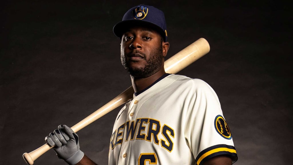
The logo leaked in recent weeks, but another major element of the change remained under wraps until Monday’s announcement: a fresh kit of uniforms, including cream replacing the traditional home whites.
“We know there are going to be some people who wanted us to go back to the old ball-in-glove without any changes,” Brewers president of business operations Rick Schlesinger said. “Then there’s going to be some fans who say the current system was great. Maybe there’s even two of three people who say we should have gone back to the ‘94-‘00 version; I don’t know who those people are, but maybe there are some people.
“At the end of the day, I would sell this: We have elements from all of our historical brands and logos and uniforms. If you liked one particular system of our history, you’re going to find it somewhere.”
Look close and you’ll find hidden meaning everywhere, starting with the worst-kept secret in baseball since the Brewers introduced the ball-in-glove in 1978. Perhaps you remember the moment you first saw the lowercase “B” next to the lowercase “M” that together form a baseball glove. It was the creation of a University of Wisconsin-Eau Claire art student, Tom Meindel, who wasn’t a baseball fan but nevertheless submitted one of nearly 2,000 designs in a contest sponsored by the Brewers in the late 1970s.
The Brewers wore the logo from 1978-93, the final season of Robin Yount’s Hall of Fame career. In ‘94, for their 25th season in Milwaukee, the club made the dubious decision to change to an interlocking “M” and “B,” then changed again in 2000 with a script “Brewers” adorned with barley to mark the pending move to Miller Park.
That look was retired on Monday night at Miller Park in favor of an entirely new look, with current players Ryan Braun, Brent Suter, Brandon Woodruff and Keston Hiura modeling the new uniforms for some of the men who wrote the franchise’s history, from Bud Selig and Bob Uecker to Cecil Cooper and Rollie Fingers. In the crowd was Elaine Meindel, the widow of the original designer, who presented Brewers owner Mark Attanasio with a belt buckle her late husband had forged after the Brewers won the 1982 American League pennant.
“We started this in 2016 and it’s been a work in progress,” Attanasio said. “Hopefully next year we have a championship team, a great new logo, and 50 years to celebrate.”
The ball-in-glove is back -- with some measured changes.
Details, details
Rather than simply revert to the old logo, the Brewers introduced some new elements to a classic look:
• In the old ball-in-glove, the tip of the letter “B” and the start of the “M” are separated. Now, they are purposefully connected, meant to symbolize the connection between the team and its community.
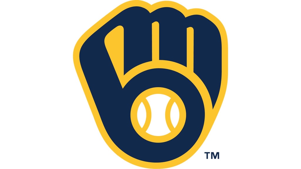
• The baseball in the new glove is centered and has proper seams, an update from the stylized original. The new look divides the baseball into three parts, who represent the Brewers’ fans, their city and their state.
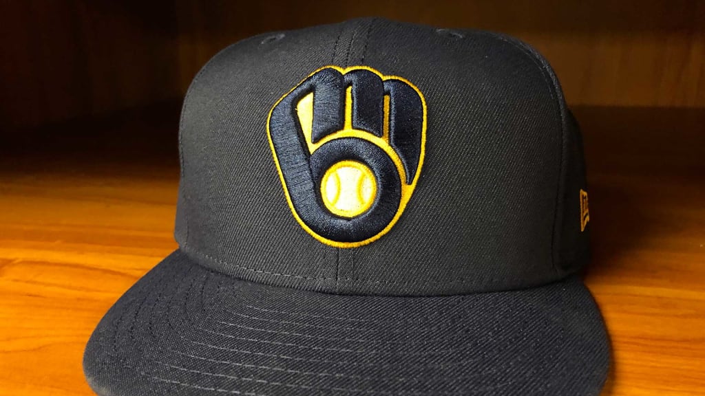
• It makes permanent a change from original royal blue to the team’s recent use of navy blue, a blending of eras introduced several years ago when the Brewers donned new alternate uniforms. But around the new, circular primary logo is a band of royal blue to represent the past.
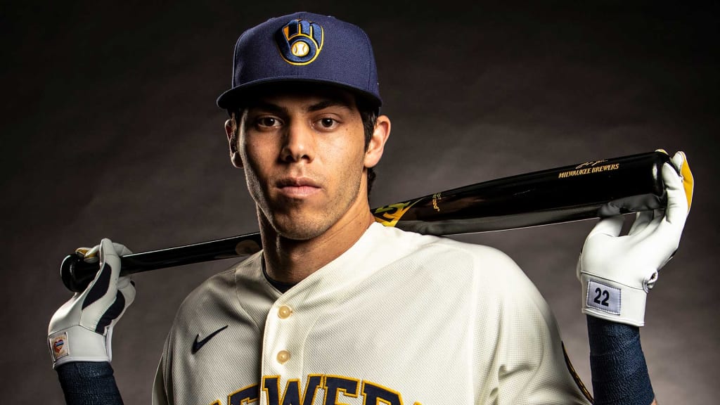
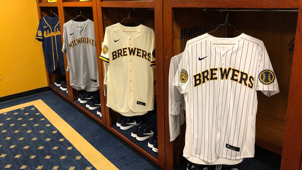
• The primary home uniforms have a cream-colored base instead of white. Milwaukee is known as the Cream City because of the Cream City brick used to build many of its structures in the mid to late 19th century, which gets its color from the unique clay in southeastern Wisconsin. And the new primary uniforms feature wide piping on the sleeves reminiscent of the Brewers’ original uniforms in 1970.
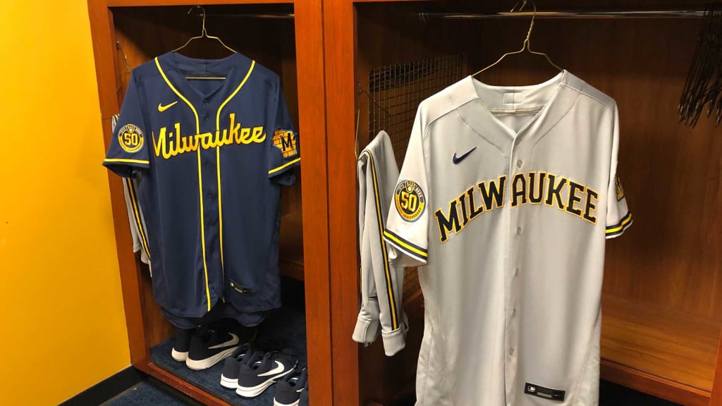
• The alternate home uniforms are white with familiar pinstripes, matching the Brewers’ look when they first introduced the ball-in-glove. On the left sleeve of both versions of the home uniform is a baseball patch with seams of barley, borrowing from the 2000-19 logo.
• The gray road uniforms read “Milwaukee” in capital letters across the chest with a reimagined Wisconsin state outline logo on the sleeve with roots in the early 1970s and again in the late ‘90s. The logo features Cream City brick and a baseball representing Milwaukee’s location.
• Alternate road uniforms offer a completely new look with a navy base and yellow piping down the front, with Milwaukee in a new script.
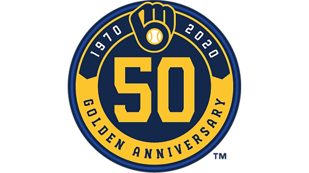
• On the right sleeve of all four uniform combinations, the Brewers will wear a circular 50th anniversary patch in 2020. That element is just for one season. The others are here to stay.
“We’re hoping this is going to last for generations,” Schlesinger said.
The process
It began about two and a half years ago in a meeting with Attanasio. The discussion began with talk of more subtle changes like altering the script on the team’s uniform, updating the colors, or adding some sort of new alternate jersey.
The Brewers interviewed a number of brand specialists before intentionally hiring one -- Mississippi-based Rodney Richardson of RARE Design -- who had no ties to the Brewers or Wisconsin, and had never rebranded an MLB team. Most of his high-profile experience is in the NBA, where Richardson has done work for the Minnesota Timberwolves, Charlotte Hornets and Sacramento Kings. Notably, Richardson did not come to the initial meeting with any design ideas. That’s one of the reasons the Brewers chose him, Schlesinger said. It was a blank canvas.
Within the first 6-8 months of the process, Richardson presented a variety of possibilities, including sketches of some radically different looks.
“Going into this process, the Brewers didn’t put any pressure on us to go one way or the other,” Richardson said. “They said, ‘We’re going to go through this process and discover the things we need to discover.’ The reality is that anyone who is any kind of sports fan whatsoever, you’re familiar with the ball-in-glove icon, how tremendous it is and how beloved it is.”
Richardson vaguely remembers his own “aha” moment as a boy when he saw the “M” and “B.”
“That just blew my mind,” he said. “That’s always been a really good example of a clever design, a design that can help tell stories that people don’t initially expect, and tell stories that are uniquely relevant to this club and this place and being special only in that place. That’s where some of the most meaningful components of an identity come from.”
So, the question was not whether the ball-in-glove belonged. It was a question of where it fit. And, after a consensus developed about going for a total overhaul of the logo, uniforms, colors and branding of the team -- all based around the ball-in-glove – a new question arose.
How far would they push the redesign?
“We weren’t at all fearful to explore how far can we push it and still represent all the things that this identity still needs to represent,” Richardson said. “It got ‘out there.’ But I think intuitively we knew, and the organization knew, like, ‘That’s not it. That goes too far. We’ve got to respect the character of this mark.’
“But then, there are small updates to it that help the team tell stories that are near and dear to them. Like connecting the ‘M’ and the ‘B’ in the glove itself. That small thing from a design standpoint may not seem like that big of a deal, but what that tells from the team perspective is they see that bond between this city and this game.”
When Richardson presented the final product to a group of club officials, including Attanasio and his wife Debbie, and sons, Dan and Mike, Schlesinger remembers the response being universally positive.
What’s next
By Opening Day, the Brewers plan to have updated every instance of their logo in and around Miller Park. It is a monumental task that includes signage inside and outside the stadium all the way to the farthest parking lot, plus retail and publications and untold square footage of Brewers-logo carpeting. Everything down to the business cards.
“They have gone the entire four corners of this ballpark and also virtually, because … everything online has logos,” Schlesinger said. “For the last year and a half [we] have literally identified every place both in the virtual world and the real world, both in Miller Park and around Miller Park, that have the old logo.
“It’s a huge undertaking, and if we get 99.9 percent of it, that would be great. I’m sure there’s going to be a few things we miss. It might be a little game with our fans to find the old Brewers ball-in-glove.”
Hide and seek began Monday night, with Braun, Suter, Woodruff and Hiura sporting the new uniforms and showing off the logo.
Richardson was there to watch his work come to life.
“Man, I am always anxious before one of these things,” he said. “One of the things I love about athletic branding is there are thousands and thousands of people who are passionate about this, who feel ownership, who feel personal investment into these identities. That is such a big deal whenever we are designing these.
“We want them to love it because we’ve fallen in love with their story, with their team, with what’s happening here. It’s not following any design trends or anything like that. It’s about representing this team and this place and their love for this game. We want to see that resonate.”