
MIAMI -- Capturing the brightness and energy of Miami without losing touch with the city's rich baseball past, the Marlins on Thursday unveiled their new logos and colors.
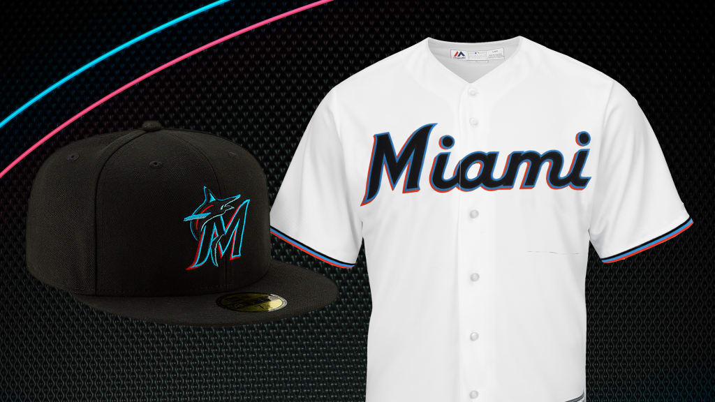
The rebranding introduces the color scheme of "Caliente Red, Miami Blue, Midnight Black and Slate Grey." The organization will have not one, but two logos -- a primary that has an image of a marlin swirling around baseball stitching above the word Miami, and a secondary logo of a marlin looping over an M.
• Shop for the new gear
Thursday's unveiling didn't come unexpectedly, since the Marlins social media account had sent out teasers for more than a week -- providing glimpses of the colors and new uniforms. On their tweets were #OurColores (colors in Spanish) and the date of 11.15.
The refreshed look further puts a stamp of the ownership group headed by Bruce Sherman and Derek Jeter on the organization.
"It's a new beginning, a new chapter in this organization," Jeter said. "There's a lot of history here with this organization -- some good, some bad. But we have a new group that's in town. We want this to represent a new beginning."
• Get a "First look"
The new merchandise goes on sale at 9 a.m. ET Friday on Marlins.com, as well as at the New Era Team Store at Marlins Park.
"We want to put our own mark on the organization," Jeter said. "We have a plan, we want to build an organization that we can be proud of and Miami can be proud of ... I think it differentiates the past, the present and the future. It was important for us to do this. We're extremely proud of our new logo, our new colors. We think it's reflective of the Miami culture. We think it captures the energy, the diversity of Miami. We're extremely proud, and we feel our fans will be as well."
Jeter and Sherman addressed the media on Thursday night at the Ocean Drive Cover Party at Bar Bevy in the Miami Design District. Jeter is featured on the cover of the November issue of Ocean Magazine.
Previously, the colors were black, yellow, red-orange and blue.
Jeter noted that the organization thought about bringing back teal, prominent in the early years of the franchise. But instead, it opted to create a new image.
"We thought about it, but we wanted to move forward as an organization, and not necessarily look back," Jeter said. "We will still offer the teal uniforms in retail. We know how special it is. There's a lot of history, a winning history, with those colors. But we wanted to move forward."
The Marlins released the logos and colors on their social media account late Thursday afternoon. One tweet with an animated image read: "In this next capture -- looking ahead."
Moving forward is a common theme in the rebranding of the franchise, along with an emphasis of capturing the diversity of Miami.
In their first year, Marlins' ownership encouraged feedback from fans while acclimating themselves to South Florida.
The decision was made to incorporate colors that are commonly seen on the streets of Miami, or on the large variety of cultural flags flown throughout local neighborhoods.
The styling of the "M" is commonly found in Latin-American culture, and the font style may look familiar to longtime South Florida baseball fans. There are similarities of the M to the original Miami Marlins and the Havana Sugar Kings, former professional clubs that played in the 1950s.
With the marlin's upward body position, the primary logo was designed to appear athletic and powerful.
The new logo and colors are part of a major offseason rebranding. On Friday, the new uniforms will be unveiled, as various team representatives will be making visits throughout South Florida.
Since purchasing the franchise from Jeffrey Loria in October 2017, Marlins ownership has pledged to build the organization from the ground up.
On the field, there has been a commitment to create a strong Minor League foundation that will eventually rise to the big leagues.
Off the field, the organization has focused on reconnecting with the market, while making Marlins Park a destination.
Earlier in the week, the Marlins announced two major ballpark revisions. Replacing the Home Run Sculpture in the outfield will be a new Center Field Zone, and a standing room only (SRO) section is being added down the right-field line.
The outfield walls will be painted the same ocean blue that is on the logo.
Rebranding is nothing new for the Marlins.
From their inaugural 1993 season until 2011, they were the Florida Marlins, while sharing Hard Rock Stadium with the Miami Dolphins. Marlins Park opened in 2012. As part of the agreement to move into the retractable-roof stadium, the team changed its name to the Miami Marlins.
"It's very exciting," Sherman said. "The logo, I think, is very representative. A lot of effort went in to look into the colors and vibe of Miami."