

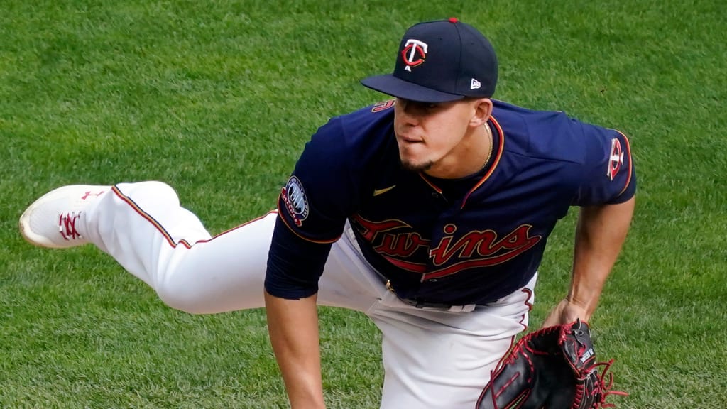
MINNEAPOLIS -- Major League Baseball's logos are among the most recognizable trademarks around the country -- and, in some cases, beyond it. The interlocking "NY" of the Yankees is ubiquitous around the world. The ball-and-glove Brewers logo is iconic around the sport. The interlocking "LA" of the Dodgers is timeless.
Going down the list, every logo's tie to its club is obvious -- except for one. The Minnesota Twins have an interlocking "TC" logo despite the letter "C" not appearing anywhere in the name. Why is that?
The short answer is that the "TC" stands for "Twin Cities" -- signifying, of course, the Minneapolis-St. Paul metropolitan area. The longer answer requires a trip back in time to before the franchise relocated from Washington to Minnesota in 1961.
There's a proud history of organized baseball in Minnesota, and a rivalry began in earnest when the newly formed American Association (no relation to the modern-day independent league) included professional teams in both Minneapolis and St. Paul as part of its inaugural season in 1902. The Minneapolis Millers and the St. Paul Saints would enjoy fierce competition across the Mississippi River until the Twins' arrival in '61, as detailed in a SABR article by Rex Hamann.
Here's the thing: When Calvin Griffith and his family relocated the Washington Senators franchise to the Upper Midwest, every North American professional sports team was named after a city, not a state, region or province. Still, considering the baseball legacy of both Minneapolis and St. Paul, Griffith was loath to name his team after one of the two cities -- and the same line of thought applied to the club's new logo.
"When it came down to the creation of the 'TC,' they were reluctant to put an 'M' on the cap, because most people would have, at the time, maybe thought that also stood for Minneapolis, so they didn't want to upset the city of St. Paul," Twins president Dave St. Peter said. "So they really embraced the Twin Cities, and 'TC' became the mark."
That's also why the Twins (named after the Twin Cities, of course) also bucked tradition to name themselves after the entire state of Minnesota and not one of the cities. It's worth noting that the relocated Twins' first ballpark, Metropolitan Stadium, was located not in Minneapolis or St. Paul, but in Bloomington, to the south.
The Griffiths understood that the Twins had plenty of potential to be a regional draw not only around Minnesota, but also in Wisconsin, Iowa, North and South Dakota and perhaps states even further west due to the sparseness of teams in the area. Milwaukee had not yet regained the Brewers at that time, and one could go all the way west from Minneapolis to the Pacific Ocean without hitting another MLB team. (The short-lived Seattle Pilots weren't established until the end of the decade.)
The Twins could be the team of choice for a large swath of the plains and Rocky Mountains states -- with the state of Minnesota as the focal point of the branding.
The club remained under the "TC" branding until the 1987 season, when the club rebranded and introduced the block "M" logo, seemingly secure in the idea that residents of St. Paul would continue to associate the Twins with Minnesota, and not just Minneapolis. The "TC" remained as a sleeve patch on the pinstripe uniforms, but the club's immediate World Series triumph in '87 certainly helped bring good will to the new imagery as well.
When Griffith died in 1999, the Twins brought the "TC" cap logo back as a home alternate in his honor to widespread positive reception from fans, according to St. Peter, who first joined the organization in '90 and has been president since 2002. Following the Twins' most recent rebranding in '10, the "TC" has again been the sole primary mark.
Still, the remnant of those old days of coaxing unity between Minneapolis and St. Paul endures in the form of the massive logo of Minnie and Paul shaking hands across the Mississippi River at Target Field, which lights up when a Twins player hits a home run.
"I think people found [the 'TC'] logo and that mark to be very unique, something that our franchise could own, and it was beloved," St. Peter said. "It still is beloved to this day. In our mind, it's the most popular team logo in the state of Minnesota."