

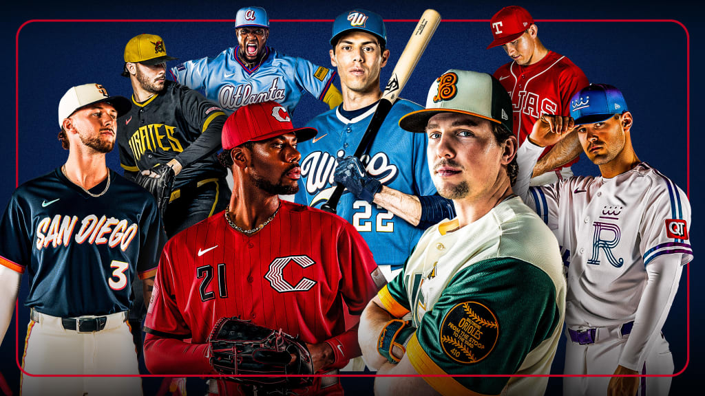
It’s all connected. The past to the present and the people to the places, with baseball serving as a bridge.
Eight clubs unveiled a new wave of City Connect uniforms for 2026 on Thursday, and the bold new looks for the Braves, Orioles, Reds, Royals, Brewers, Pirates, Padres and Rangers were billed by MLB as reflective of “the energy and pride of each club’s community, offering bold and expressive interpretations that celebrate both team history and what’s ahead for the game.”
First launched in 2021, the City Connect brand of alternate uniforms have presented teams in novel color schemes, typefaces and graphics that are designed to reflect cultural aspects of each team’s home city. Teams are able to rotate in a new jersey after three years to debut a new look. For each of the eight teams involved in Thursday's announcement, this is the second installment of City Connects.
Each club partnered with Nike and Fanatics, MLB’s uniform manufacturer, to build off its previous City Connect styling and delve into other aspects of their city, region and fan base. The new uniforms will remain part of each club’s on-field rotation for multiple seasons to come.
The design descriptions for the eight new looks are as follows:
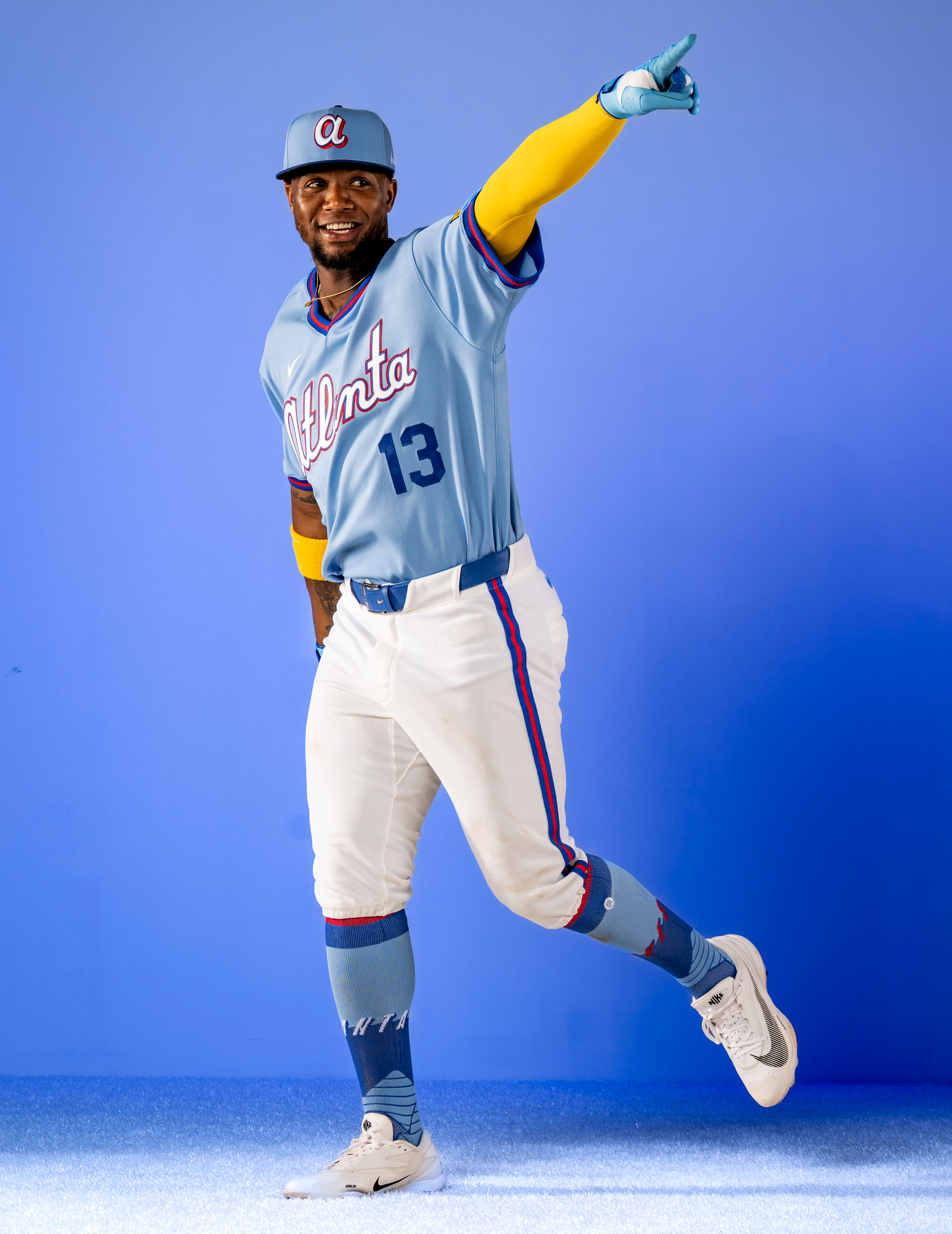
Atlanta Braves: The powder blue uniforms of the 1980s were the inspiration for a modernized design with red piping, an updated “Atlanta” script and “ATL” block letter sleeve patch. The team’s contemporary color scheme is paired with the throwback style. More >
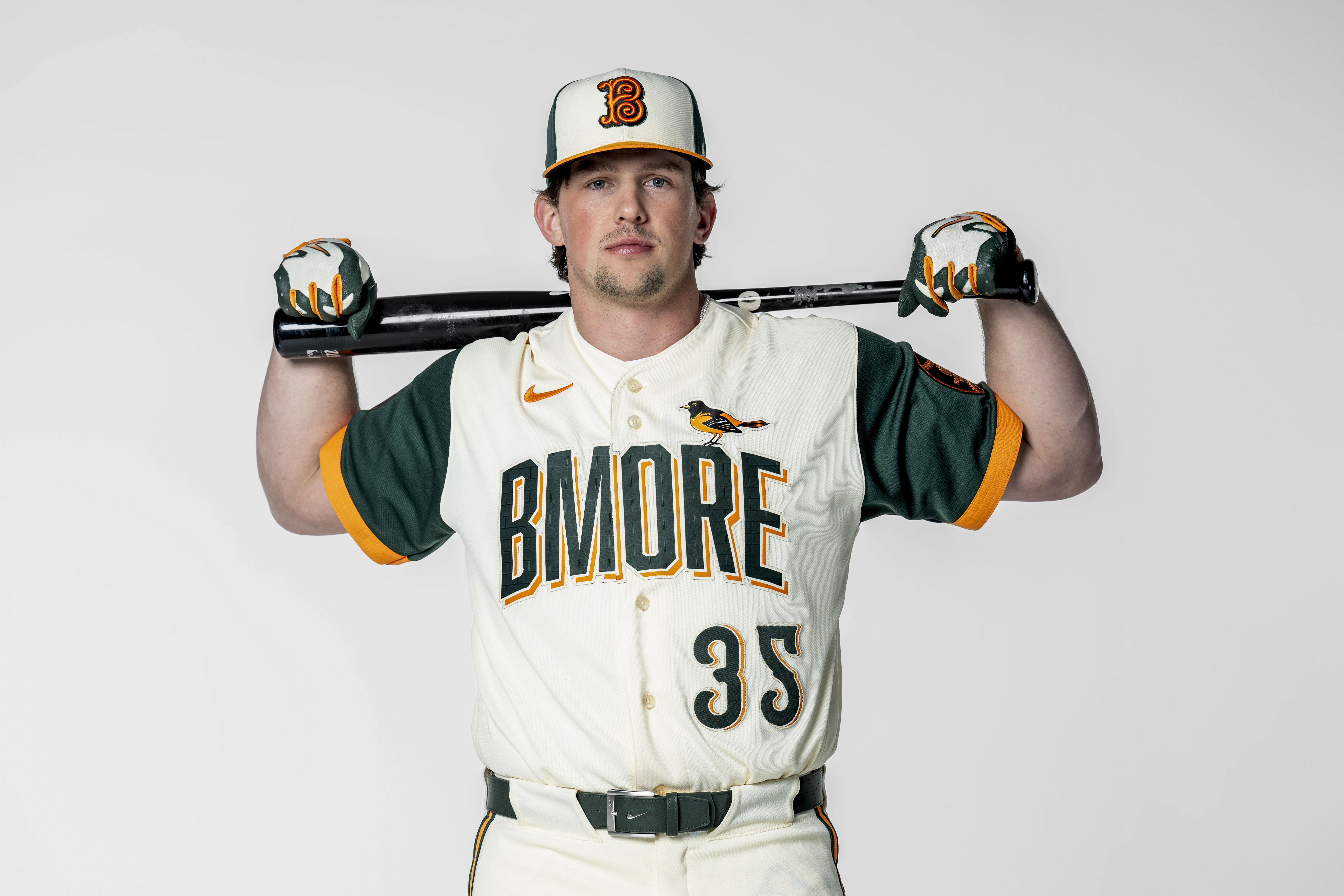
Baltimore Orioles: The O’s threw it way back to the 1890s Baltimore Baseball Club for inspiration for the old-school “B” on the cap, and the uniform design pays tribute to Camden Yards with motifs that include the brass home run plaques and the wrought-iron scoreboard clock. The Oriole bird sits perched atop the “BMORE” lettering. More >
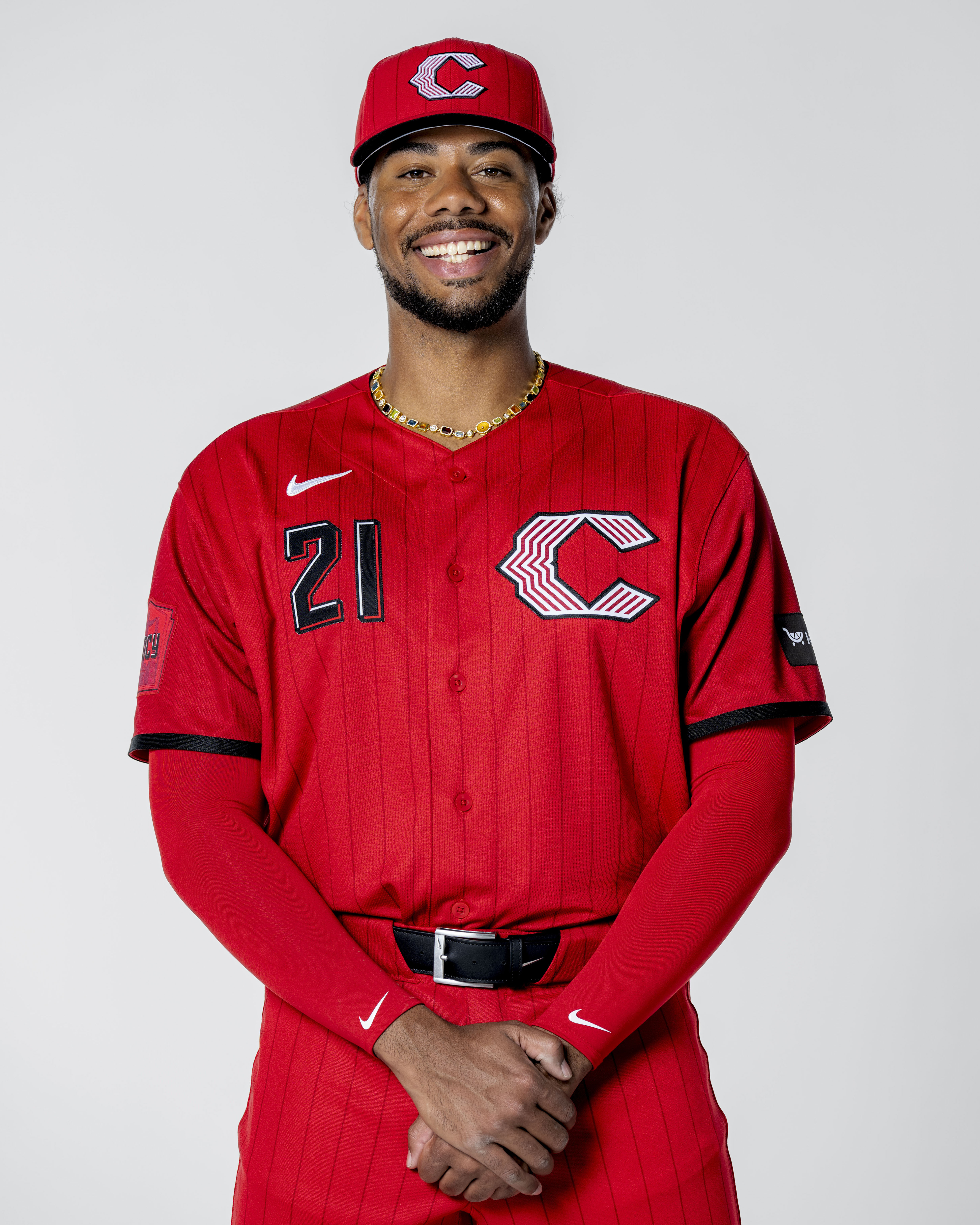
Cincinnati Reds: With a nod to the vest-style jersey the Reds last wore more than two decades ago, pinstripes return to the fore in a tone-on-tone style. A sleeve graphic features the Tyler Davidson Fountain, which begins flowing each year around Opening Day. More >
Kansas City Royals: The city’s official City of Fountains logo inspired a fuchsia-to-blue gradient that highlights Kansas City’s iconic waterways. A new twist on the “R” logo pays homage to the team’s original 1969 mark, and a heart logo reflects Kansas City’s placement in the country’s heartland. More >
Milwaukee Brewers: Honoring the Brew Crew’s role not just as Milwaukee’s team but Wisconsin’s team, a water-toned base and cream accent evoke the Badger State’s lakes, shores and bluffs, and a gradient wordmark is inspired by the state’s beautiful summer sunsets. The “Wisco” lettering on the chest, state motto on the collar and redesigned Barrelman sleeve patch all serve to celebrate the team’s history and Wisconsin’s rich heritage. More >
Pittsburgh Pirates: The pirate-style wordmark on the chest draws inspiration from the city’s three “Sister Bridges” across the Allegheny River, while red accents and Jolly Roger elements bring a splash of color to the black-and-gold backbone that is elemental to Pittsburgh sports tradition. More >
San Diego Padres: Celebrating San Diego’s bi-national culture, with a focus on Día de los Muertos, the design features a chest wordmark reflective of a sunset, a La Catrina sleeve patch, marigold-patterned trim, bone-colored hat and pants and in a nod to Mexican folk art, a papel picado jock tag. More >
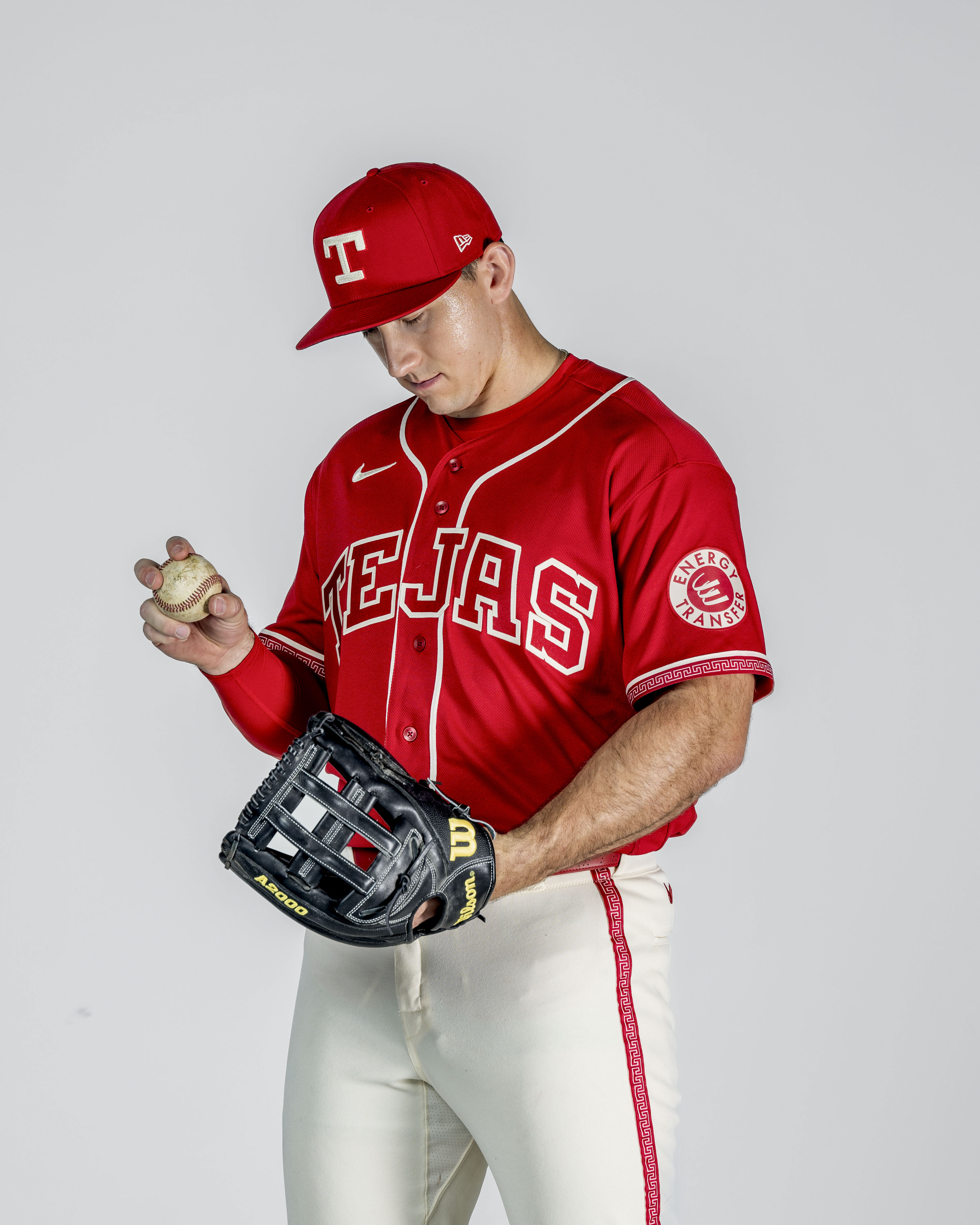
Texas Rangers: The Rangers also celebrate Mexican heritage near the border with cochineal red anchors and a “Tejas” wordmark across the chest, as well as a charro-embossed belt and mariachi-inspired fill patterns. More >
Nike’s 2026 MLB City Connect jerseys and additional team apparel are available to fans at MLBShop.com, nike.com, fanatics.com, the MLB Flagship Store in New York, team stadium stores and additional select retail locations.