

MLB.com is starting a new series seeking to answer some of the common questions about teams’ traditions, stadiums, players and history -- the sorts of things that might begin at a pregame tailgate with someone asking, “Did you ever wonder why …” Look for more entries in the coming weeks, and if you have a question that needs answering, feel free to submit it via one of the links in the tagline at the end of this story.
MILWAUKEE -- Did you ever wonder why the Brewers’ primary colors are blue and yellow?
And can you picture them in red and navy, the color scheme they were originally intended to wear?
Those details are among the unintended consequences of the unique birth of the Brewers, who have origins in the 1960s when Bud Selig and other Milwaukee civic leaders formed Teams Inc. -- an acronym for “To Encourage All Milwaukee Sports” -- with the aim of preventing the Braves from leaving Milwaukee for Atlanta. When those efforts failed, Teams Inc. was reincorporated to the Milwaukee Brewers Baseball Club, and Selig led a years-long effort to acquire another franchise.
Besides working to land a team, Selig had to keep the community connected to baseball. So, he purposely chose a name -- Brewers -- and a color scheme -- red and navy -- with deep roots in Milwaukee’s baseball history. The colors were worn not only by Hank Aaron, Eddie Mathews, Warren Spahn and the Braves, but also by their professional predecessors, the American Association Milwaukee Brewers, who played on the near north side of Milwaukee at Borchert Field.
Selig attended games there with his mother, an avid fan. Conjuring memories of that team, Selig hoped, would help Milwaukee’s other baseball fans forget their forced divorce from the Braves.
“I figured it would make people smile when they remembered life before the Braves, who, in complete hindsight, exploited our city and robbed any future efforts of the goodwill of baseball fans,” Selig wrote in his 2019 autobiography. “I understood what fans were feeling because I was one of them.”
Early marketing materials for the “new” Brewers were in red and navy blue, featuring the team’s “Barrelman” logo.
But in the end, there was no time. On April 1, 1970, when a federal bankruptcy judge in Seattle ruled that the Pilots were to be sold to Selig’s group and moved to Milwaukee, Opening Day was less than a week away. The equipment truck, which had traveled from Spring Training in Tempe, Ariz., to Salt Lake City to await word of whether to go west to Seattle or east to Milwaukee, sped east. When it arrived, traveling secretary Tommy Ferguson took a look at the uniforms and telephoned Selig.
“[Ferguson] said, ‘What do I do about uniforms? They’ve got ‘S’ on them,’” Selig recalled. “I said, ‘Well, you rip off the ‘S’ and put on an ‘M’. That’s all we have time for. And that’s exactly what happened.”
Just like that, the long-held plans to don the Brewers in red and navy were scrapped. Instead, the team simply adopted the nautical theme of the Pilots, who wore cream home uniforms accented with royal blue and yellow or gold.
“At that point,” Selig said, “I just wanted to get us on the field.”
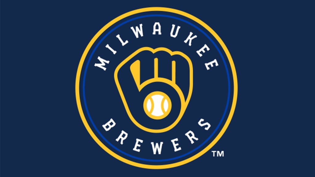
Contemporary accounts suggest that the converted Pilots uniforms were to be only temporary, but instead they stuck. And while the Brewers’ look changed in 1978, when the block “M” was replaced by the iconic ball in glove logo, the royal blue and yellow color scheme stuck. Until the mid-1990s, that is, when the Brewers took an unfortunate detour toward a scheme that included navy, gold and green.
Today, the Brewers wear a somewhat modernized version of their original colors. In November 2019, the team introduced an updated ball in glove as its primary logo and a color scheme built around a darker shade of blue along with the traditional yellow.