
MINNEAPOLIS-ST. PAUL, MN – Honoring yesterday’s heroes in a crisp, dynamic and modern design built for tomorrow’s legends, the Minnesota Twins today officially unveiled their new marks and uniforms. Current Twins players Luis Arraez, Byron Buxton, Jose Miranda, Jorge Polanco and Joe Ryan joined club legends Rod Carew, Kent Hrbek, Torii Hunter, Joe Mauer and Justin Morneau, among other team officials and alumni, at a reveal event at Mall of America® in Bloomington, Minnesota.
Today’s event showcased the Twins’ refined “TC” logo, new “M and North Star” mark, exclusive new font and wordmarks, and the club’s four new uniforms – one home, one road, one home alternate and one additional alternate that can be worn at Target Field or on the road. The official launch of the Twins’ next chapter is the culmination of a multi-year process and the franchise’s first complete design revamp since before the 1987 season.
“Today is a proud, historic and – above all – truly exciting day for the Minnesota Twins and our fans,” said club Executive Vice President Joe Pohlad. “Our new look reflects the North Star we’ve set our organization towards, as it celebrates our special bond with our home community, honors our heritage and pushes us into the future in a dynamic, modern and uniquely Minnesotan way.
“We are proud to be Minnesota’s baseball team, we are driven to create a bold new standard of excellence and we cannot wait to take the field in these fun, vibrant new uniforms that – like our organization itself – are inspired by the past and built for the future.”
More on the Minnesota Twins’ new marks and uniforms can be found below, or by visiting twins.com/alltwins. Exclusive new Twins merchandise is available for purchase today (Friday, November 18) at a special Mall of America Twins Pop-Up Store only (located on the west side of the Rotunda), and beginning Saturday, November 19 at the Target Field Twins Clubhouse Store (open 10 a.m. to 5 p.m. daily; closed on Thanksgiving).
VISION AND PROCESS
The Minnesota Twins began the brand refresh process in early 2020; the resulting new design system is a celebration of the club’s legacy, powerfully and cohesively modernized through a crisp, vibrant and forward-thinking lens. The future of the Twins’ on-field aesthetic was set by Joe Pohlad and the organization’s senior leadership team, in extensive collaboration with internal and external stakeholders. The Twins’ vision was brought to life through the talent and eye of Minneapolis-raised and New York-based Matthew Wolff, a globally-renowned graphic designer and art director specializing in sports branding, logo and jersey design. Nike, the Official Uniform Supplier of MLB, New Era, the Official On-Field Cap of MLB and Stance, the Official On-Field Socks of MLB, are producing the on-field look of the Twins’ next chapter.
“We are incredibly grateful to our many partners who provided invaluable insight and guidance throughout, and to Matthew for bringing his incredible talent and lifelong passion for the Twins to this project,” Pohlad said. “This was truly a labor of love for all involved, and we’re thrilled to deliver a look that Twins fans will rally behind and call their own for generations to come.”
DESIGN SCHEME, EXCLUSIVE FONT AND COLORS
The Twins’ marks and uniforms of recent years featured an out-of-sync hodgepodge of logos and design elements from different eras. The franchise’s new and cohesive system – constructed from one design palette to bring a unifying look throughout – features both refined and new marks, highlighted by the beloved “TC” logo; a bold new “M and North Star” mark; a modernized “Twins” script recalling iconic elements of both the original club lettering and recent patterns; an arched, blocked “Minnesota” wordmark reminiscent of championship glory; and the market’s first-ever “Twin Cities” lettering.
Additionally – and for the first time in Twins history – no elements are outlined in a secondary color or accentuated by a drop shadow. This key component of the crisp, modern look allows visuals such as scripts, names and numbers, sleeve emblems and colors, to resonate in a crisp, vibrant way.
The entire collection is also tied together by a powerful new font – a lettering and numbering system designed exclusively for the Twins that is bold, innovative and uniquely Minnesotan. Taking its cues from the curvature of the hand-drawn “TC” mark and the power serifs of the Target Field-era “Twins” script, the font is carried throughout the entire system, from marks to jersey lettering, player names and numbers.
Lastly, the Twins’ legacy color palette – embraced by the franchise since the Washington Senators debuted in 1901 – has been modernized with a slightly brighter shade of red, a boldly dark navy blue and a more brilliant sheen of white. Additionally, the iconic cream of Minnesota Twins lore returns for the first time since the 2018 season.
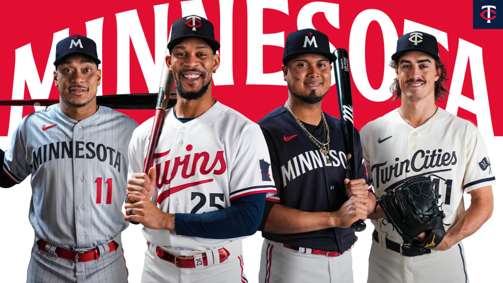
PRIMARY HOME UNIFORM AND “TC” MARK
Featuring a modernized “Twins” script recalling beloved elements of yesteryear, the return of a piping pattern first popularized by Rod Carew-era clubs and rekindled in the final year of the Metrodome, and a crisp, dynamic aesthetic celebrating the club’s updated color palette, the new home uniform is a passionate, innovative and bold embodiment of baseball and community in Twins Territory. Specific elements include:
- “TC” Hat: The first, and still most beloved, professional sports mark in Minnesota, the interlocking “TC” is ubiquitous with community and civic pride – a symbol not just of the Twins, but of our state. Staying true to the historical integrity of the hand-drawn mark that debuted in 1961, but with subtle changes in weight and composition, this sleek and refined version cohesively fits in the club’s new design system to carry the “TC” forward for the next sixty years and beyond.
- “Twins” Script: Paying homage to the original 1961 “Twins” script, the distinctive “T” is separated from the connected, cursive “w-i-n-s,” while – in keeping with club tradition first introduced during the World Championship season of 1987 – the “win” is underlined. The “Twins” script returns to red, as it was on the primary home uniform from 1972-2014.
- Piping: First seen on Rod Carew en route to his 1972 American League batting title and reintroduced on a throwback worn by Joe Mauer during his 2009 AL Most Valuable Player campaign, the sleeve and pant piping is a tri-color pattern of navy, white and red stripes.
- Sleeve Emblem: Linking to the fabled mark of Minnie & Paul standing within the state outline, the left sleeve features a navy Minnesota silhouette adorned with a red North Star, representing the location of Minneapolis and St. Paul.
- Player Name and Number: Numbers return to the front of the uniform, but – in a first for the home jersey – they are in navy to offset the “Twins” script, in a vivid juxtaposition of all three primary colors. The player’s name and number on the back (also delivered in the Twins’ exclusive new font) are presented in offsetting navy and red, respectively.
PRIMARY ROAD UNIFORM AND “M AND NORTH STAR” MARK
Updating the classic look first worn by Kirby Puckett, Kent Hrbek and Jack Morris, and then later by Torii Hunter, Joe Mauer and Justin Morneau, with a contemporary twist for Byron Buxton, Jose Miranda, Joe Ryan and those to follow, the iconic gray-and-pinstripe motif of club lore is modernized and paired with a bold new “M” hat featuring a North Star. The club’s new road uniform delivers a powerful representation of the Twins and our home state for Minnesota’s next generation of champions. Specific elements include:
- “M” Hat: As the first professional sports organization to take the field bearing their state’s name, the Twins are proud to be Minnesota’s Major League Baseball team. The sibling mark of the legacy “TC,” with a white “M” and red North Star set upon a navy backdrop, this is Minnesota’s hat – an instantly iconic representation of the Twins and our home state. As the Twins take the field with an “M” hat for the first time since the 2013 season, they will do so with their version of the North Star – a unifying emblem also shared by many of our state’s professional teams.
- “Minnesota” Script: Celebrating the Twins’ championship heritage, the arched, blocked “MINNESOTA” script returns, now in a dynamic new font and – in a team first – delivered in striking navy. In further nods to club history, the “S” features the power serifs of the Target Field-era “Twins” script, while the “T” is inspired by the heritage “TC” mark.
- Pinstripes: Every Twins player inducted into the National Baseball Hall of Fame wore pinstripes at some point in their Minnesota careers. Previously featured on home uniforms (1961-71, 1987-2014), road jerseys (1987-2009) and alternate home offerings (2010-18), the Twins’ classic look returns, updated in a subtle, gray-on-gray color scheme.
- Piping, Sleeve Emblem, and Player Name and Number: The heritage navy, white and red piping is carried through on the road uniform, as is the Minnesota-silhouette sleeve emblem. Numbers remain on the jersey front, but in red; the player’s name and number on the back are presented in offsetting red and navy, respectively.
ALTERNATE HOME UNIFORM
The Twins have worn a “TC” on their hat or uniform throughout their 62-season history, without ever spelling out the full name of their seven-county location – until now. Proudly becoming the first professional team to feature “Twin Cities” across their chest, while reintroducing the organization’s iconic cream color, the Twins’ new alternate home uniform is a powerful celebration of the club’s heritage and continued legacy in Minneapolis and St. Paul. Specific elements include:
- Colors: The only two-color uniform in the system reintroduces the Twins’ legacy cream – worn from 1961-71 and again in the 2010-18 home alternates – in a dynamic dual-tone cohesion with the club’s new shade of boldly dark navy blue. Sleeve and pant piping utilize a singular navy stripe to create a two-color effect, while the player’s name and number (front and back) are presented in navy.
- “TC” Hat: The refined “TC” adorns the hat, but – in a first for a Twins on-field uniform – the mark is a singular color, with both letters appearing in the legacy cream upon a navy backdrop to complete the striking two-tone aesthetic.
- “Twin Cities” Script: The first use of the region’s full name on a professional sports uniform, “Twin Cities” is spelled out in navy, using the dynamic cursive of the Twins’ exclusive new font, and underlined in classic club fashion. A subtle water ripple effect can be drawn from the bottom of the letters in “Cities” as a nod to the Mississippi River.
- Sleeve Emblem: Celebrating Minneapolis and St. Paul in true Twins fashion, the left sleeve features the “M” and “STP” marks that have adorned the jerseys of Minnie & Paul, respectively, since 1961 – now emblazoned upon crisscrossed flags to represent the shared history of baseball within our twin cities.
ALTERNATE HOME/ROAD UNIFORM
Evoking the alluring mystique of a Minnesota night sky, the Twins’ new alternate uniform – the first in team history meant for both home and road – is a majestic canvas for the club’s new shade of boldly dark navy blue. Specifics include:
- Colors: The Twins’ new shade of boldly dark navy blue is the primary color for both jersey and hat, dynamically playing off a brilliant white and the club’s vibrant new red.
- “M” Hat and “Minnesota” Script: The alternate uniform carries through the pairing of the new “M” hat with the “Minnesota” script.
- Home and Road: For the first time in team history, the Twins have an alternate uniform that can be worn both at home (with white pants) or on the road (with pinstriped gray pants). When the uniform debuts at Target Field, it will mark the first instance of the Twins wearing the word “Minnesota” at home.
- Sleeve Emblem: The left sleeve features the refined “TC” mark, with the iconic white “T” and red “C” set upon the navy.
- Piping, and Player Name and Number: The heritage navy, white and red piping is again featured, as are the offsetting colors of player name and number (the number is red on the front and white on the back; the player’s name is red).