

It's been an awfully busy winter around the Majors. Gerrit Cole is in the Bronx. Mookie Betts is headed west. (Anthony Rendon, too.) Heck, there'll probably be another blockbuster trade swung by the time you're done reading this.
But those aren't the only major changes coming to MLB this year. Teams will be looking different, too -- turning back the clock, peering into the sartorial future and just generally getting a little weird. There's been a lot to keep track of over the past few months, so in case you missed it, here are all the new uniform changes we'll see in 2020, arranged from most to least drastic. (You know, aside from the swoosh.)
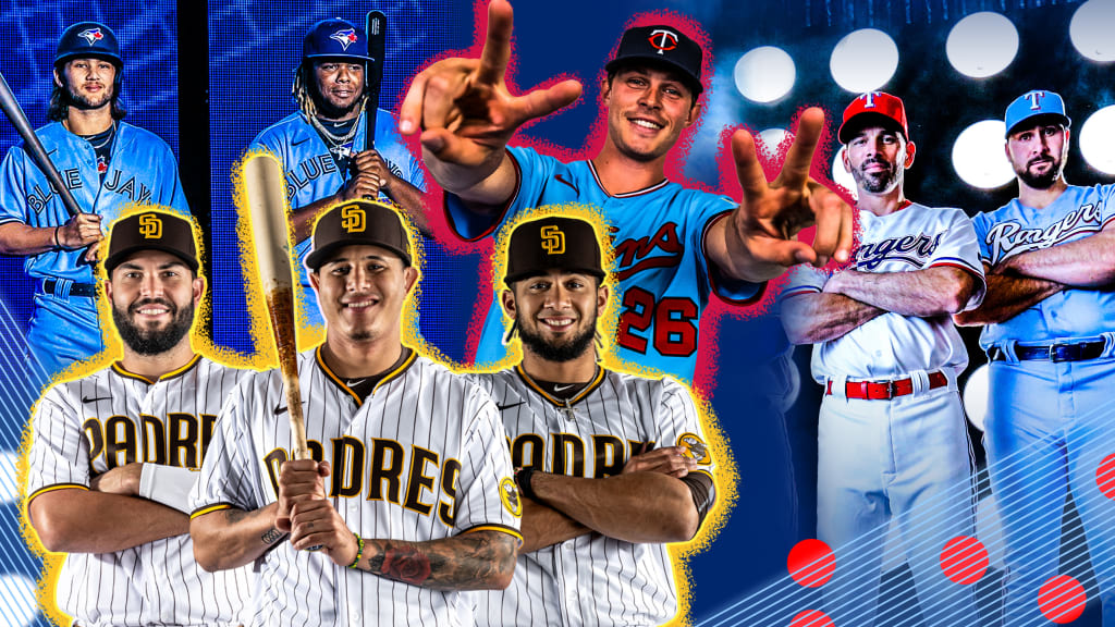
Padres
We have just five words for you: The brown is back, baby.
After nearly three decades in various forms of navy blue, San Diego is going back to its roots -- while also looking forward, updating its classic look with a shimmering gold that pops against a deep, rich shade of brown. (Plus, both the white home uniforms and the gray road alternates marry the vintage color scheme with the pinstripes the team rocked in the '80s and '90s.)
As if that weren't enough, the new brown hats really emphasize the interlocking "SD," which has long been one of the most underrated logos in sports.
Brewers
Elsewhere in long-awaited returns: At long last, Milwaukee is set to bring back the ball-in-glove logo, and she looks as good as ever. (Hey, did you know there was an "M" and a "B" hidden in there too?)
But that's far from the only change as the team celebrates 50 years in Milwaukee. There's a whole new suite of uniforms, too, three of which will sport block letters not far from the ones the team wore in its infancy in the 1970s -- calling back to the Robin Yount-era look while still retaining the newer navy blue, a lovely marriage of past and present.
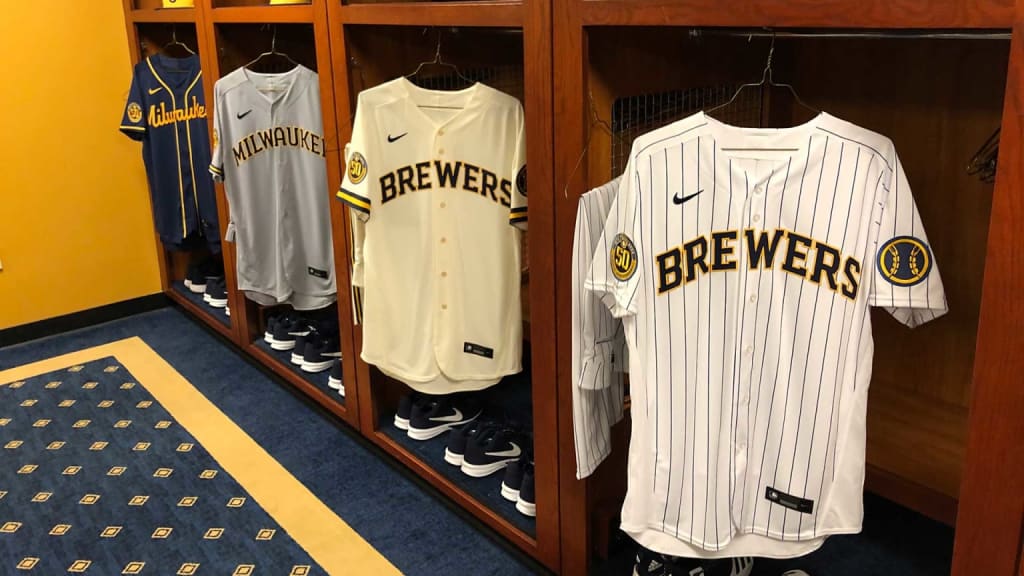
(There are pinstriped home alternates and a navy road alternate with yellow script lettering. Personal favorite, though: The Brewers opting for cream instead of white for their standard home jersey, in honor of Milwaukee's legacy as the Cream City.)
Rangers
Hey, if you're about to open a spanking-new ballpark, you need some new threads to go with it -- and boy oh boy did Texas go for it. They still have red and blue alternates (the former at home, the latter on the road), but there's a new "TX" logo in town, and the team's main home whites will now feature "Rangers" in bold blue script across the chest:
Oh, and did we mention there's powder blue on home Sundays? There's powder blue on home Sundays:
Blue Jays
Speaking of powder blue! In addition to unveiling a slightly sleeker bird logo, Toronto is dusting off the baby blues that it first rocked in the '70s and '80s. These aren't simply throwbacks, though -- these are New Blues, and they are electric (and, in an unconventional twist, accented with a dark navy):
Twins
Speaking of powder blue, part three! Minnesota was one of MLB's powder-blue pioneers, wearing it regularly on the road from 1973 through '86. To mark its 60th season in the Twin Cities, the team brought back that look relatively unchanged, down to the red script across the chest, although this time, the blues are alternates that can be worn at home or away from Target Field.
D-backs
Where some teams went big, Arizona opted for a cleaner approach, light on big changes but with some minor tweaks. Gone is the diamond pattern that used to adorn the neck and shoulders of most of the club's uniforms; gone is the slate gray road look, replaced with a lighter, more traditional shade; gone is the teal that used to go with that slate gray. Don't worry, though -- the teal isn't gone for good.
Pirates
Barry Bonds and Bobby Bonilla might not be taking the field in Pittsburgh anymore, but that doesn't mean we can't party like it's 1991 all the same -- preferably while wearing the Pirates' new road looks, a standard gray and black alternate that comes with the iconic script lettering the team wore during its early '90s heyday.
Reds
Cincy will introduce a new red alternate in 2020, and it's a beaut -- from the giant cursive "Reds" to taking any possible excuse to slap Mr. Redlegs' face on something.
Nats
OK, technically these aren't new -- Washington first broke them out during Spring Training last year -- but they'll debut during the regular season in 2020, so we'll count it anyway. There's a clean, white alternate with "Nationals" in navy script across the chest, but the real headliners are two alternate caps, both of which hearken back to the old Washington Senators logo -- one in back of a pitcher ...
... the other in front of the Capitol building.