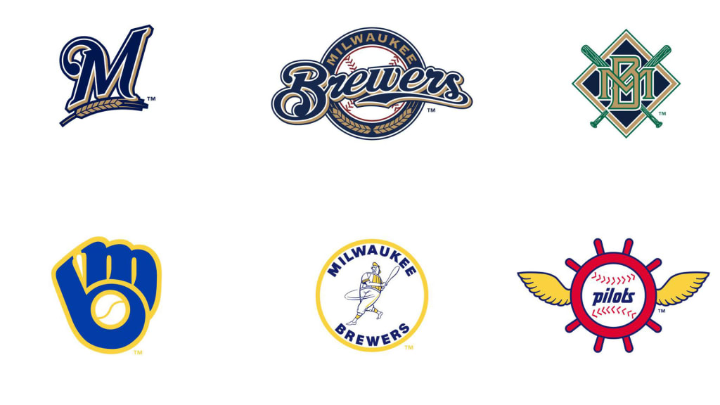
MILWAUKEE -- Is the Brewers’ iconic ball and glove logo making a comeback? “Stay tuned,” a club spokesperson said.
Rumors have circulated for years that the Brewers were working with Major League Baseball on a full-time return to the iconic ball and glove, which served as the club’s primary logo from 1978-93 and produced many an “ah ha” moment when fans discovered the letters hidden within. Now there is some evidence that it is actually happening, in conjunction with the club’s 50th anniversary in 2020.
A tip from an eagle-eyed Twitter user tipped off the website SportsLogos.net on Monday to a preview of the Topps 2020 baseball card set. Within, there is a Bernie Brewer card featuring an updated version of the old ball and glove, with some subtle changes to the webbing of the “glove” and a shift in the look and position of the baseball, all encircled with “Milwaukee Brewers” in capital letters.
Is this the Brewers’ new logo?
Here is what a club spokesperson had to say Tuesday morning:
“We have many plans for our 50th anniversary year, significant initiatives that we expect will add excitement for our fans and partners. More news on our 50th celebration activities will be coming in the coming months. In the meantime, we suggest that everyone stay tuned for more details.”
That will be the Brewers’ only comment on the matter for now, the spokesperson said.
The original ball and glove was designed by 29-year-old University of Wisconsin-Eau Claire art student Tom Meindel, who wasn’t a baseball fan but nevertheless submitted one of 1,931 designs in a contest sponsored by the Brewers. He won $2,000. The introduction of the new look coincided with the hire of a new GM (Harry Dalton) and manager (George Bamberger), the debut of a hotshot infielder (Paul Molitor) and the emergence of the Brewers as a bona fide contender in 1978, when the club improved by 26 victories to 93-69 and began a five-year run during which only the powerhouse Baltimore Orioles won more games.
In 1994, the first season after Robin Yount’s retirement, the Brewers shifted from the AL East to the AL Central and introduced an entirely new look with an interlocking M and B that reminded many of the University of Notre Dame logo. In 2000, with the franchise having shifted to the National League and the move to Miller Park on the horizon, another new logo was introduced, with a script “Brewers” over a baseball and flanked by a sprig of barley in a nod to Milwaukee’s brewing heritage. The cap logo from that time, a simple script “M” with barley underneath, took over as the primary logo in 2018.
The ball and glove remained beloved throughout those changes, and since 2006 has been part of the Brewers’ uniform kit, first worn as an alternate look and then with increasing frequency over the years. For the 2017 season, the Brewers gave the logo an update by combining the retro yellow with the club’s current navy.
Now, it appears the time is right for another update.
Still to be answered is just how far the Brewers will go with their updated look. Making changes to the logo and uniform kit is a multiyear process in conjunction with MLB and its many corporate partners before a team can unveil entirely new uniforms. As of Tuesday, the team had nothing to announce on that front.
So, stay tuned.
