


MINNEAPOLIS -- St. Paul illustrator Ray Barton never made it to the new Target Field before he died in April 2010, which meant he never got to see the most prominent display of his art with his own eyes.
He didn't think it was one of his better works, anyway.
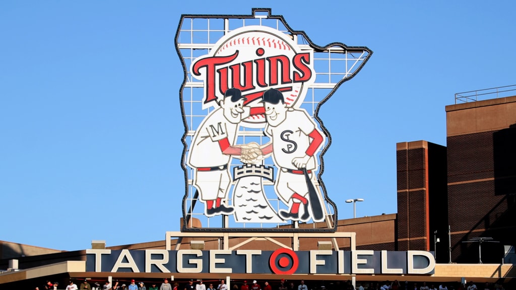
Artists may be their own harshest critics, but chances are, you've seen and enjoyed Barton's unexpected magnum opus. It's hard to miss, considering it's 46 feet tall, stands prominently over the center-field batter's eye and lights up every time a Twins player hits a homer. It's the large Minnie and Paul home run celebration sign at Target Field, Barton's enduring legacy in his hometown community.
"He said, 'I've got a lot of my sketches for my work and my ads, but that was the worst job,'" remembers Twins historian Clyde Doepner, who visited Barton several times over the years. "He put it down himself. Not that it wasn't really cool what it turned out to be -- he thought that was cool."
It was never really meant to become a statue to begin with. When Barton received the $15 commission from owner Calvin Griffith in 1961, he assumed his art would only be used for marketing and advertising purposes on beer cups. The only instruction Griffith gave Barton, according to Doepner, was that the illustration should represent the Twins and that it should show Minneapolis and St. Paul in a partnership across the Mississippi River.
So, Barton came up with the idea of showing two players shaking hands across the river. Minnie represented Minneapolis and Paul represented St. Paul. It was important for the Twins to show unity between the two cities following the conclusion of the longstanding baseball rivalry between the Minneapolis Millers and St. Paul Saints due to the arrival of the Twins.
The Twins only made one significant tweak. Barton's original design had "MT" on both Minnie and Paul to represent the new "Minnesota Twins" name. Instead, they replaced those with an "M" on Minnie and an "STP" on Paul.
Then, the Twins surprised Barton by slapping the logos everywhere -- beer cups, programs, merchandise and, most prominently, as a sleeve patch on their uniforms. The Minnie and Paul patch was part of the home jersey from 1961-86 and the road kit from 1961-71 and '73-86, and variants later arose throughout the club's history. Today's Twins still wear the patch on their left arms as part of every home uniform except the navy blue alternates. The art also featured prominently into the logo of the 1965 All-Star Game at Metropolitan Stadium.
"That's the longest strand to me," Doepner said. "You know, the Yankees have stayed pretty loyal to their jerseys, while we've changed our jerseys over the years, and we do our throwback ideas. But when you think of the one thing that has endured from game one to the first game in 2021, it's Minnie and Paul shaking hands over the river."
The only shame is that none of Barton's original sketches have endured because he threw them all away after he submitted the art to the Twins. But in erecting the massive logo at their new ballpark, the Twins have continued to play their role in making sure the artist's contribution to their franchise remains properly appreciated.
"He said, 'Who would have thought that my two caricatures -- literally the only caricatures that I ever did -- who would have thought the two caricatures would be what I'm remembered for? I have gone all my years doing some great artist work,'" Doepner remembers. "And that's the way life is."