


The Marlins have sported a handful of looks since their inaugural season in 1993, including their current logo and uniform set that debuted in 2019.
Taylor Swift isn’t the only one with eras. Here’s a comprehensive look at the three major ones in Marlins history.
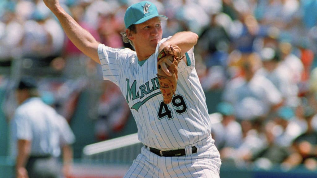
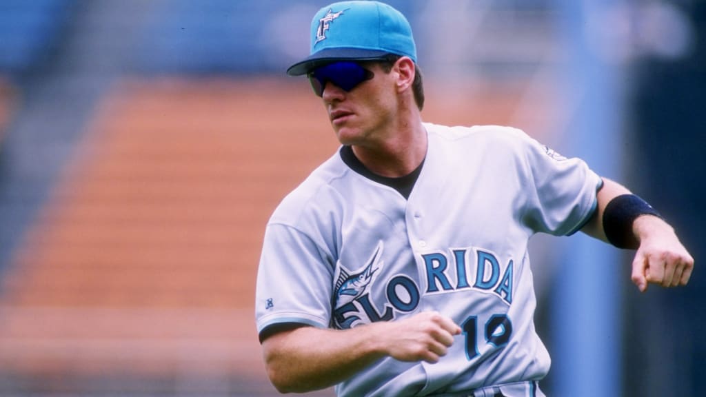
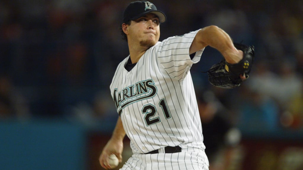
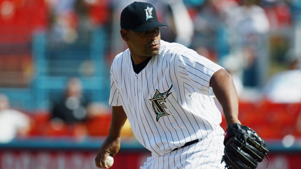
1993-2011 (Florida Marlins Era)
As legend has it, original owner H. Wayne Huizenga preferred the “Florida Flamingos” but got talked out of it by the design director for Major League Baseball Properties. Electing to go with the Marlins’ name was twofold: It had been part of South Florida baseball lore twice before with Minor League affiliates; and the late Huizenga had been an avid fisherman who had caught plenty of black and blue marlin.
When it came to deciding on the primary color, teal had become popular with the NBA’s Charlotte Hornets and the NHL’s San Jose Sharks around that time.
That much was certain at the uniform unveiling on July 9, 1992, when the Miami Herald’s Dan Le Batard wrote that it would feel like South Florida.
“The primary color is something between aqua and teal, a little like our beaches and our skies. Team officials call it ‘Marlins blue,’ saying it is too unique to be merely aqua or teal or blue. It is softer than the aqua worn by the [NFL’s Miami] Dolphins, with not nearly as much shine. The pinstripes will be in this color, as will the framing on the black number and name on the back of each jersey.”
That same day, Bob Rubin of the Miami Herald wrote: “Marlin blue has the look of South Florida's ocean, and was designed to blend in well with the aqua-and-orange Dolphin motif of [Joe Robbie Stadium].”
The home white uniforms were pinstriped with teal and sported “Marlins” across the chest in teal with black trim and an underline after the “S.” The road gray uniforms had “Florida” across the chest in teal with black trim and a marlin's tail along the “F.” Each pants leg had a teal stripe down its length.
There were three cap designs, all featuring a leaping marlin intertwined with the “F”: all-teal (home), all-black (alternate) and a combination of a teal crown/body with a black bill (road).
The alternate uniform, which was worn during Sunday home games, was nearly the same as the white jersey except for a vest and a teal undershirt to combat the hot temperatures. In 1996, the teal undershirt was replaced by black.
All three uniforms featured the primary logo patch on the left sleeve and the player number in black on the right below the script.
By the late 1990s, teal was gradually being phased out. Until the 2026 season, teal returned just two other times: in June '18 for a series against the Padres to commemorate the franchise’s 25th anniversary; and on select Flashback Fridays in '23 to celebrate the 30th anniversary.
Road uniforms continued to feature "Florida" but shared the same font and color scheme as the home uniform with an underline after the letter "A.”
In commemorating their 10th anniversary in 2003, the Marlins tweaked their uniforms so that the home whites used black pinstripes, trim teal and black numbers and lettering. The road grays did the same while also removing the Marlin from the “Florida” script and using the home font.
In 2003, the Marlins also introduced a pair of alternate uniforms: black jerseys with “Florida” spelled out in teal and silver lettering with white accents, and white jerseys with black pinstripes and the Florida Marlins logo on the left pectoral. Both lacked the front chest numbers.
In 2010, the Marlins replaced “Florida” with “Marlins” on the road design. The sleeve logo patches were also removed.
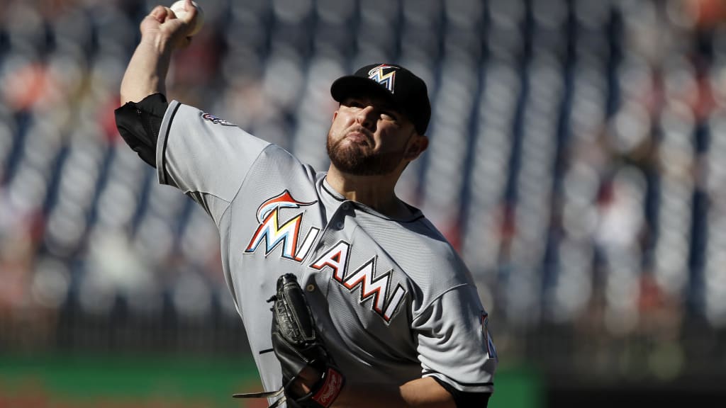
2012-18 (Miami Marlins Era)
In conjunction with the move to their own ballpark in the Little Havana neighborhood, the Florida Marlins rebranded to the Miami Marlins.
According to a Sun Sentinel article from 2009, then-owner and art dealer Jeffrey Loria was already considering honoring the region’s Hispanic heritage and borrowed a palette of primary colors — red, blue, yellow and green to go along with white, black and silver — from celebrated Spanish artist Joan Miró for the ballpark’s quadrants and uniforms.
At a special event featuring Grammy-winning rapper and Miamian Pitbull, the organization revealed four uniforms.
The home white, road gray and alternate black each had “MIAMI” in block lettering across the chest to emphasize the move. A sans-serif-esque "M" with a leaping abstract marlin made up the logo, which appeared as the “M” on each of the jerseys. The orange alternate had “MARLINS” across the chest with the fish located atop the letter “I.”
That night, Loria said that the primary colors were "symbolic of the sunsets and the citrus industry, sunshine, the sky and sea” and that “we are unique, we're sleek and different, and we are the colors of Miami."
The home whites included orange piping around the collar, sleeves and down the pants legs; the road grays and orange alternates had black piping; and the black alternates consisted of white piping on the jersey and black piping on the pants.
Both the home and road uniforms featured black letters with silver trim and orange drop shadows on the numbers. The alternate black uniform had white letters with silver trim and orange numbers with silver trim and black drop shadows. The orange alternate consisted of the team name in white with blue accents, black letters with silver trim and blue drop shadows on the numbers.
The Marlins primarily wore all-black caps, though they donned all-orange caps with the orange alternate jerseys for a brief period of time. The “M” logo was both the cap logo and a patch on the left sleeve.
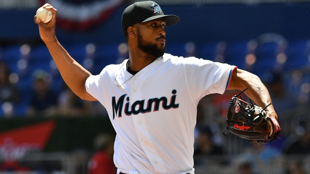
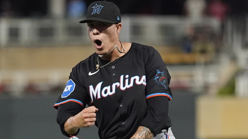
2019-present (Current Era)
A year after Bruce Sherman’s ownership group took over, it unveiled a new logo and colors.
In order to capture Miami’s energy, the Marlins introduced Caliente Red, Miami Blue, Midnight Black and Slate Grey – colors commonly seen on the streets of Miami – particularly on the various flags throughout its neighborhoods.
Rather than keep the block “M,” the organization styled a curvier one often found in Latin American culture, with a font style similar to the original Miami Marlins and the Havana Sugar Kings. The primary logo has a marlin with an upward body position that appears athletic and powerful. The secondary logo, which could be found on the blue alternate jerseys, had the same marlin swimming through a baseball.
At the time, the organization aimed to move forward with the rebranding of the franchise rather than go with a throwback look.
“The logo and colors aim to capture the rich baseball history, diversity and energy of the area,” the Marlins said in a release. “The pairing of Miami Blue and Caliente Red pop off of the base color of Midnight Black, energizing the script and giving the logo an electric and vibrant look emblematic of the Miami energy and nightlife.”
The home white and road gray uniforms contain “Miami” across the chest in black lettering with red and blue accents. The black alternate uniform originally had “Marlins” in black lettering with red and blue accents until updating them in 2024 with white lettering to improve visibility. They have used all-black caps with the primary logo. The secondary logo features the same marlin swimming through the seams of a baseball.
The Marlins also introduced a Miami blue alternate uniform, featuring the black "Marlins" lettering with white trim and red drop shadows.
City Connect uniforms
In 2021, the Marlins unveiled a City Connect uniform inspired by the Cuban Sugar Kings.
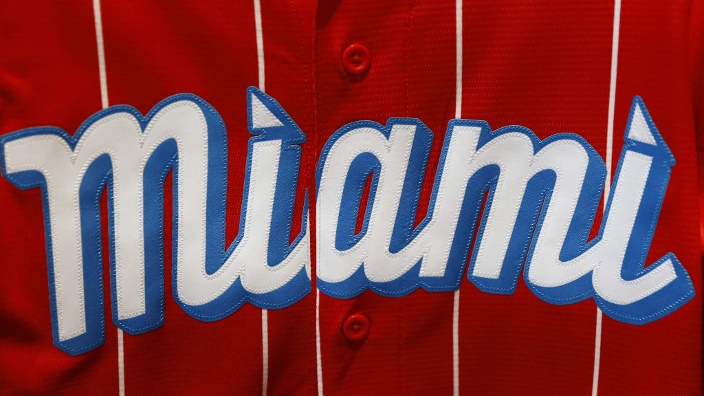
In 2025, the organization retired those in favor of City Connect 2.0 “Retrowave.” These featured Miami Vice-inspired pink and teal with “305” area code branding.