


MINNEAPOLIS -- This week will mark the last time Twins fans will be able to take in baseball games at Target Field in 2022, and by the time they return next April, things will look different -- both around the ballpark and on the field.
This fall and winter, the Twins are planning to unveil a "brand refresh" that will include tweaks to their fonts, logos and uniforms, which will go hand-in-hand with a new, 76% larger main videoboard from Daktronics and other in-ballpark elements to the fan experience at Target Field that will provide a new look for the fanbase by Opening Day 2023.
"It will be kind of an evolution of the past with what we think is a fresh look," said Dustin Morse, the Twins' vice president of communications and content. "I think this will be a nice combination of Twins history with a new, clean, fresh feel that we're pretty excited about."
The main colors of the Twins' brand -- the core red, white and blue -- will not change, Morse said. Though the Twins will not reveal details about any of the new uniforms until they officially unveil them this offseason, there are different factors to think about in the home, road and alternate configurations, including color combinations, number placement and the uses of patches and fonts.
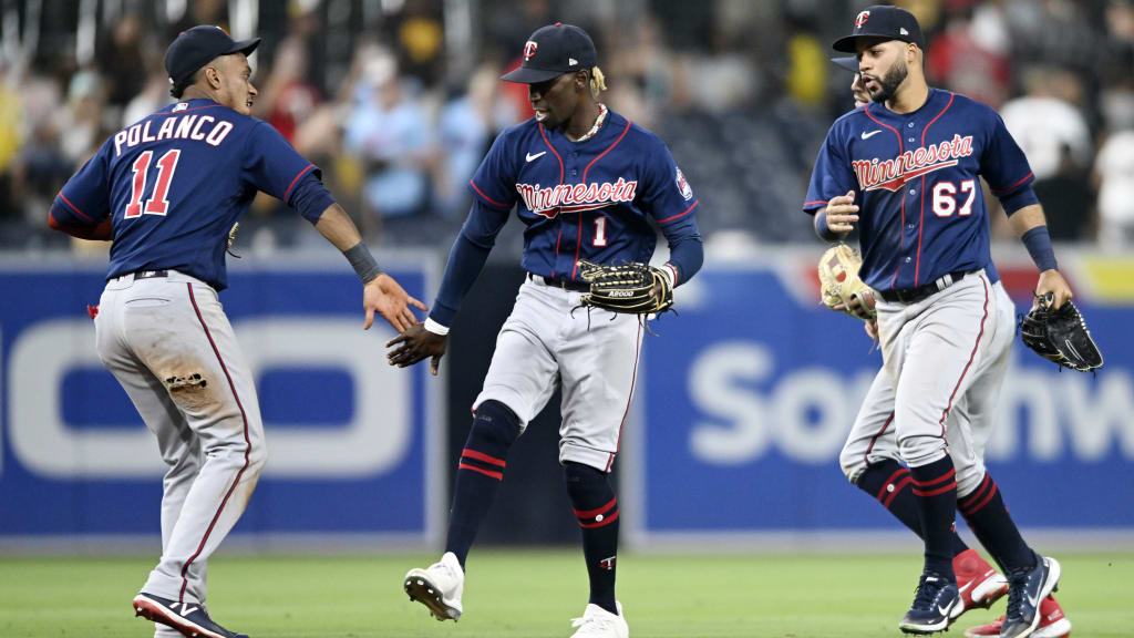
The Twins have used their current base home white uniforms since 2015, featuring the same block "Twins" script across the chest that they've used since 1987. Their road uniforms with "Minnesota" stamped across the chest have not changed in more than a decade, with the classic grays in rotation since 2010 and the navy blue road alternate top in use since '11.
"The word that comes to mind for me is, 'Cleaner,'" Morse said. "It just looks a little sharper. They look fresh. And some tweaks to the logos, potentially introducing a new logo. That's all part of this brand refresh that will be introduced this fall."
How different could things look?
"That's in the eye of the beholder," Morse said. "Any time you change a look, within the Twins' closet, there's maybe some that are more of a very new, different look, and there's some with a combination of the past and cleaner tweaks to logos and fonts."
In addition to the new, primary marks to be introduced in '23, the Twins will also debut a "City Connect" uniform in '24 as part of the leaguewide push to celebrate the connections between teams and their communities that has already hit 14 clubs. According to Morse, talks about the Twins' own refresh have been underway within the organization for several years, and with the other elements of change occurring in and around the ballpark, this felt like the right time.
"There were a lot of things headed in that direction with some things happening around Target Field and Twins.com, and really, the last time that we did a brand refresh was '86 or '87, so it kind of felt like it was the right time to introduce a new look to our fanbase and our players," Morse said.
"It just felt like there was a push for a fresh look, and we kind of got a team together and started concepting what could be a new look for us, and this year was just kind of an evolution of some ideas, [we] put it on paper, and it became a reality."