
In Focus: City Connect First Wear
There is no one storyline that defines Baltimore. We are a 3,000,000-strong metropolis that will never stop being a small town of neighborhoods and individuals who truly reflect us. This Orioles uniform attests to the power of our diverse narratives, aspiring individualism and our collective journey.
Baltimoreans draw strength from the many stories, moments, victories and tragedies that have defined our 294-year, multi-layered history. A proud, gritty, outspoken community -- from Sparrows Point to Park Heights to Hopkins Plaza, the Dundalk Marine Terminal to Mount Vernon, Timonium to Tide Point and Little Italy to Liberty Heights -- that reflects the creativity and resourcefulness of the next generation of Baltimoreans, one whose parents and grandparents poured the steel, repaired the ships, founded the finest universities and greatest hospitals, welcomed the world’s immigrants and integrated the lunch counters.
And so, this O’s uniform celebrates the vision this hometown and hometown team share about a colorful, color blind, vibrant and open community that celebrates our differences and defends equal access to our fundamental American freedoms.
There is no “quit” in this place, and when adversity comes, we just start another rally.
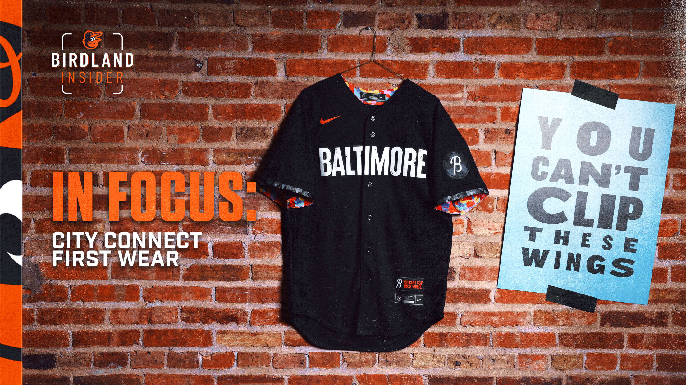
From the outside, it looks all black and white. But there’s always more to our story. In art, black doesn’t exist without color. You can’t see what you’re not looking for. Threaded from the artistic tapestry of our city, the palette is like our people: colorful, vibrant and quirky. Whether it’s our iconic rowhomes, egg custard or skylite snowballs, steamed crabs, lemon sticks or salt boxes, Fifi the poodle or pink flamingos, the Ravens or the O’s, our colors run deep here in Baltimore.
Pulled from the Baltimore script logo on our road jerseys, this "B" represents the love we have for our city. Our sleeve patch also features the new script "B" logo emblazoned atop the neighborhoods pattern -- further reinforcing our neighborhoods’ significance to the city.
The pattern is a representation of the neighborhoods that shape our city. From the corner stores and barber shops to the schools and the everyday working people in our neighborhoods -- it’s the neighborhoods that helped build us to be the proud Baltimoreans we are today. The greyscale exterior represents the surface view people have of the city. Look deeper and you’ll find the colorful interior, inspired by Baltimore’s arts culture, that highlights the vibrancy of the city. So, roll up your sleeves, dig into our culture and come see what we’re all about.
Baltimore stretches fearlessly across the front of the jersey. We’re not hiding behind a catchy nickname, and we don’t shy away. We are Baltimore. The bold typeface is inspired by the Globe Collection and Press at Maryland Institute College of Art (MICA) and our homegrown arts scene The speckled details and imperfection represent the shared grit the Orioles and the Baltimore community possess.