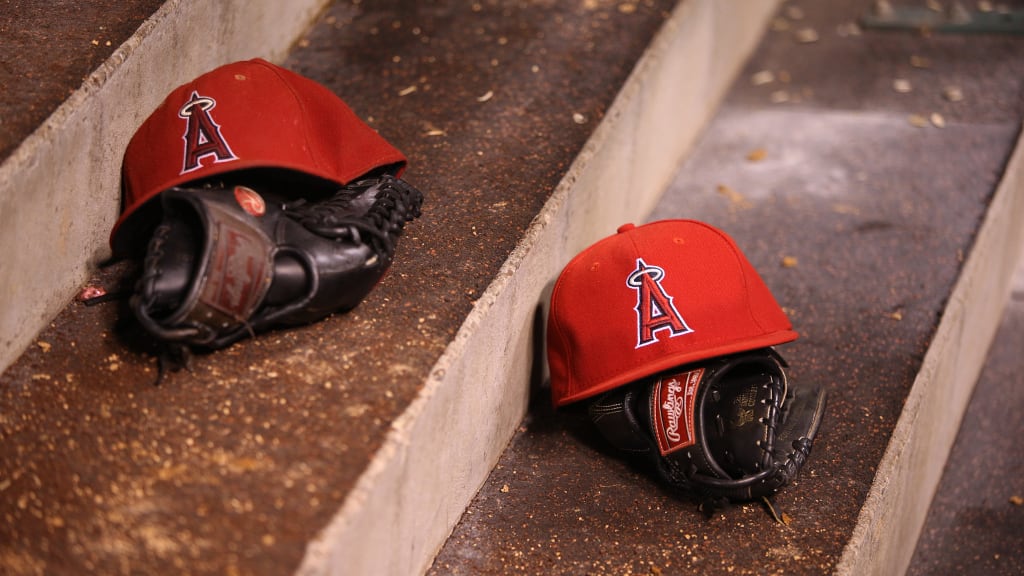
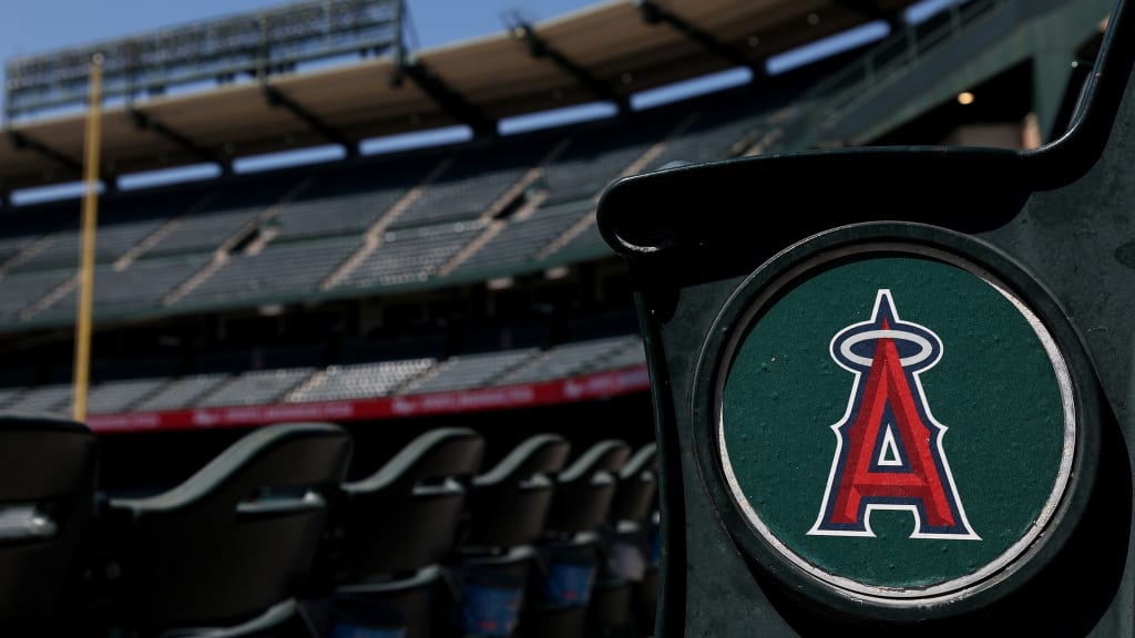
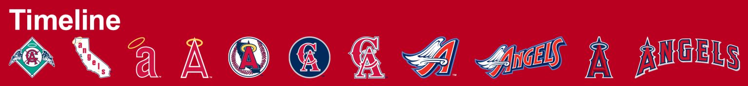
The Angels have had several primary logos since their first season in 1961, including their current red "A" logo with a gray halo and dark blue outline that debuted in 2005.
Officially, the Angels have had 10 different logos and three primary colors over the years, as they’ve undergone several name changes as well. They started as the Los Angeles Angels from 1961-65 before becoming the California Angels (1965-96), the Anaheim Angels (1997-2004), the Los Angeles Angels of Anaheim (2005-15) before returning to the Los Angeles Angels (2016-present).
Most of the primary logo changes are related to the name changes, but here’s a look at all 10 in franchise history.
1961-64
The first logo in franchise history was a throwback to the Los Angeles Angels of the Pacific Coast League. The interlocked "L.A." logo looks similar to the one the Angels used in the PCL beginning in 1912. It featured a green baseball diamond behind a baseball with the "L.A." logo and wings coming out from the sides. It also notably introduced a gold halo above the baseball -- and the halo has always been part with the franchise's iconography as a result.
1965-70
The second logo was very similar to the first but was changed to a "CA" instead of "L.A." after the Angels officially changed their name to the California Angels in September 1965 with a month left in the season. The green was also a bit darker, and the halo above the ball went from gold to white.
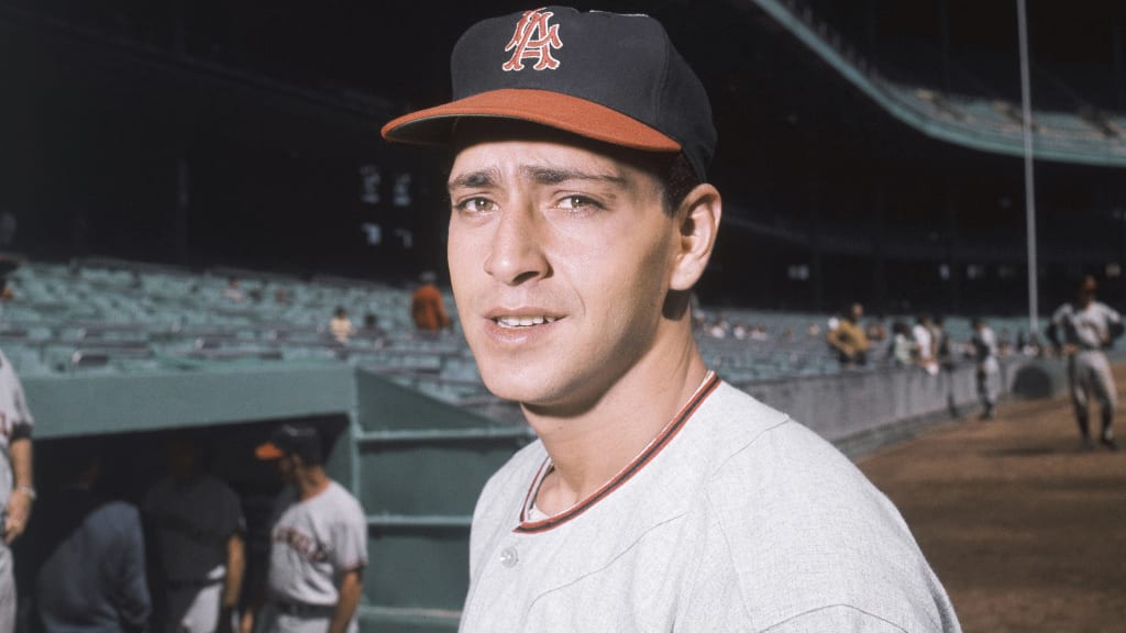
1971-72
The Angels' next logo was their first big change, as it paid homage to the state of California with an outline of the state, with a white background and "Angels" written in lowercase and in red down the state. It also featured the signature halo -- this time in gold and hanging off the top left corner of the state -- as well as a gold star representing where Anaheim is located within California. The gold halo also rested atop the "A" on the caps.

1973-85
This change was just a modification of their previous logo. This time around, the "Angels" was capitalized and had the gold Halo hang off the Big "A" at the top of the state. The star representing Anaheim also remained, but was changed to red.
1986-92
The Angels made another big change this time ahead of their run to the 1986 AL Championship Series, debuting a logo that featured a prominent stylized baseball. The state of California is in the backdrop colored in dark blue, while a red "A" is superimposed over the top with a gold halo atop the Big "A." There’s also another gold star to represent Anaheim within the state.
1993-94
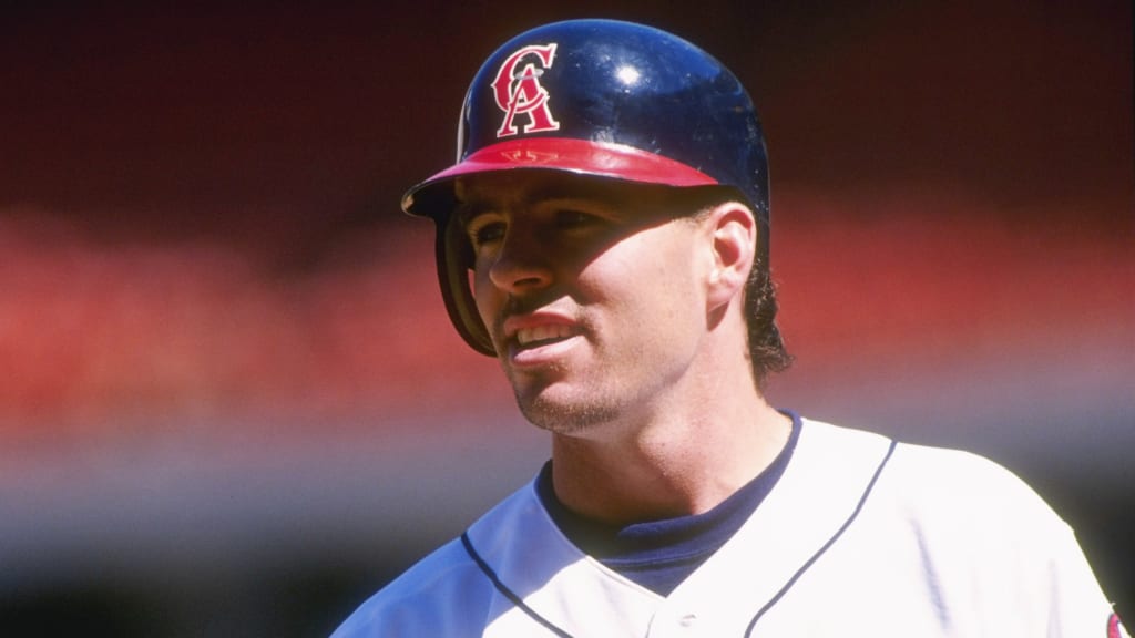
The Angels dropped both the baseball and the state of California from their next logo, going with interlocking "CA" in red with a silver halo over the "A." It's within a solid dark blue circle with a silver trim, as they dropped the gold from their logo for just the second time.
1995-96
The club kept the same logo of the interlocking "CA" in red with a silver halo over the "A," but dropped the circular blue backdrop. Otherwise, it was just a minor change.
1997-2000
When the franchise became the Anaheim Angels in 1997, it tried something new, debuting a periwinkle logo and uniforms. It featured a home plate in periwinkle as the background, along with two wooden bats with "Angels" written in a cartoon-like font across the plate. It featured the new winged "A" and had "Anaheim" written in all caps at the top of home plate. Again, there was no gold, and didn't feature a halo for the first time.
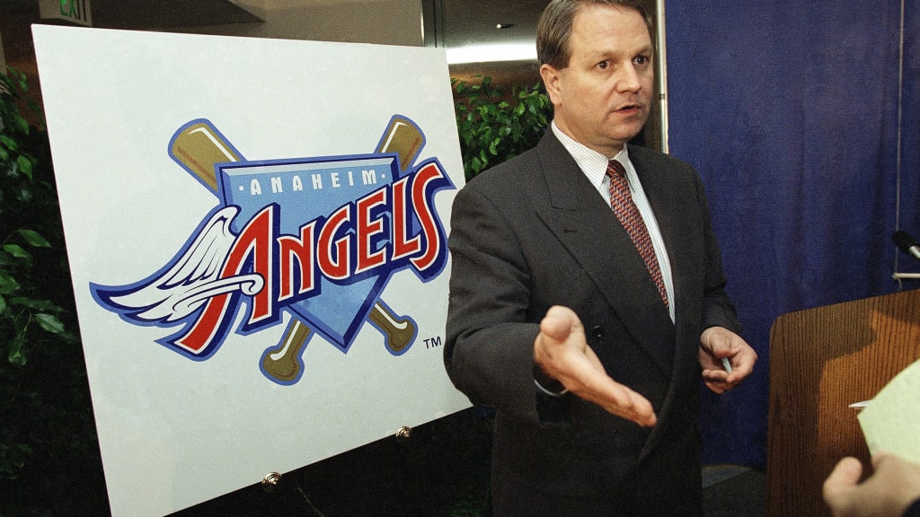
2002-04
Just in time for their World Series title run in '02, the Angels went back to a dark blue instead of the lighter periwinkle. It featured a navy-blue baseball field in the background with a red "A" in the foreground that featured a silver halo. It also had "Anaheim Angels" written over the top of it.

2005-present
When owner Arte Moreno bought the club in 2005 and renamed the franchise the Los Angeles Angels of Anaheim, the logo was once again updated to remove reference to Anaheim. It uses a similar "A" from the previous logo, but instead of a white outline it's outlined in navy blue (though the red caps and helmets are outlined in white). Unlike the previous logo, there’s no backdrop. The Angels simply became the Los Angeles Angels in '16, which is why some databases say a new logo was created that year -- but it’s the same one as the one that debuted in '05.