


CINCINNATI -- Though they are baseball's oldest professional franchise, with 154 years of history, the Reds chose not to look to the past when determining the design of their City Connect uniforms with Nike. Instead, the club leaned into the future.
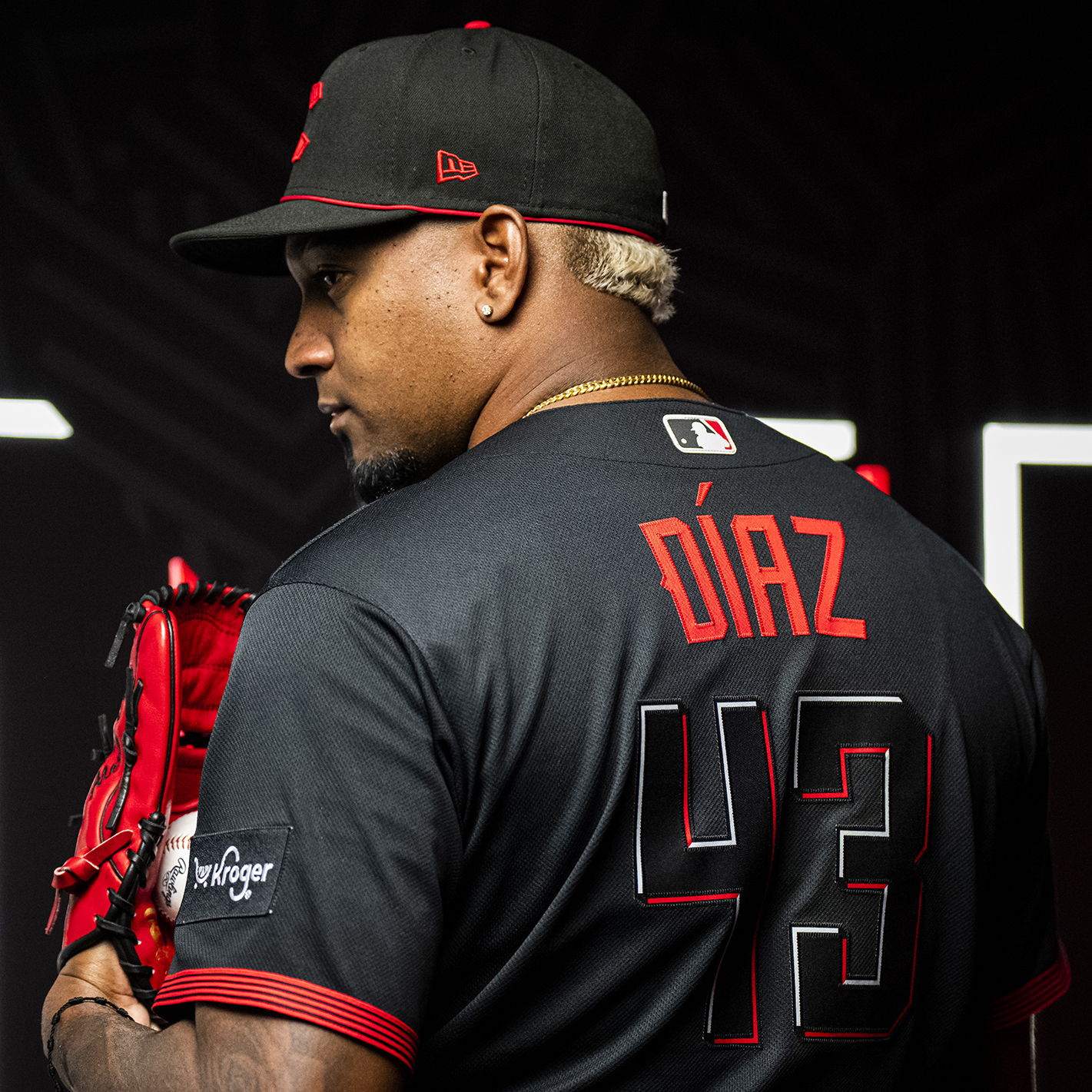
The team revealed the final design Saturday, an all-black uniform with "Cincy" in a red and white font, blazed across the chest in an infrared style. It's a look that is a purposeful departure from Cincinnati's previous uniforms and meant to attract people from younger generations.
Cincinnati will wear its City Connect uniforms for the first time during Friday's series opener of a three-game set against the Yankees, and for all Friday home games during the remainder of the 2023 season.
“We see Cincinnati as this vibrant, energetic city. It’s a cutting-edge city," said Ralph Mitchell, the club's vice president of communications and marketing. "We draw parallels from that to our current roster. We’re an energetic, young team. There’s a parallel path between the city and its evolution and the team and its evolution.”
A team that often celebrates its history, the Reds already did a look back at past uniform templates during their 150th anniversary season, in 2019, when they wore multiple throwback uniforms.
After MLB and Nike began the City Connect program in 2021, the collaboration to create the Reds’ look began and was determined that the look should be forward-thinking. The Reds wanted to reach a new audience while still trying to appeal to their existing one.
“That’s exactly where we are," Reds senior vice president of business operations Karen Forgus said. "In 2019, we did a great job in [the] 150 [year anniversary celebration] of paying attention to the past with all the different uniforms. This was really about the city vibe – now and in the future. Where are we going? Who are we today?”
Other main elements of the Reds City Connect uniform include:
• Black caps with a modernized 'C' in red. There is red piping across the front of the hat, which was actually one of the few included nods to club history. It resembles the team's 1919-era caps worn last season in the Field of Dreams game in Iowa. The same logo also appears on the sleeve.
• The batting helmets mimic the caps, with a matte black finish.
• The jersey lettering is meant to mimic illuminated neon lights, with flashes of “infrared” red color.
• Five "wavelength lines" extend throughout the side of the pants. According to Nike, the contemporary design of the piping signifies "moving forward and lighting the way to what comes next."
• On the inside of the jersey's collar is the city's Latin motto, "Juncta Juvant," which means “Strength in unity."
• A buckeye leaf, in a similar modernized style as the lettering and logos, is included to represent the state of Ohio.
“That color of red, if you look at it against our standard red, it’s much hotter," Forgus said. "You needed it to come across as more luminescent.”
Some Reds players received a sneak preview of their new uniforms during a top secret photo shoot held at Goodyear Ballpark in Goodyear, Ariz., during Spring Training.
"The black and red is really cool. It will be cool to have black uniforms," Reds starting pitcher Hunter Greene said. "I’ve been saying to our clubhouse guys, ‘Man, it would be nice to get some more black into our uniforms.’ The fact that they went all black is perfect."
The Reds have had elements of black in their uniforms since 1999, including a brief stretch where they wore black sleeves and black caps. Black shadow trim still remains in the current logo and on the uniform's letters and numbers.
But going all black for caps, jerseys and pants? That's a dramatic change.
“It will be a different look for Cincy," Greene said. "Something new, something to get fans excited about. Hopefully, it will be exciting.”
Cincinnati is the 18th team to reveal its City Connect uniforms and the fourth this season, following the Braves, Rangers and Mariners. Those teams chose to tap into the respective cities’ baseball histories.
In the previous two years, some clubs drew inspiration from local or iconic landmarks. Other clubs, like the Reds, preferred to underscore their city's overall personality.
“It’s been a long journey but a cool, fun journey. Very collaborative," Mitchell said. "We interpreted Nike’s objective of this whole program to be about recruiting new audiences and tapping into different demographics. We thought long and hard, that it’s about this city and this team, right now."